In short
A patient board shows one patient’s record at a time: timeline, clinical notes, an overview of every event. You compose its tabs and widgets yourself, like a dashboard. The collection panel lets you capture variables while reading the record — and what you type feeds straight into a dataset.
Down to the individual patient
The rest of the warehouse counts and aggregates. This page does the opposite: it shows one record, with its dates, its values and its notes.
Two uses, very different and equally important.
Verify
Check against the record what a query claims.
A cohort reports 412 patients: opening three of them and reading their records tells you within minutes whether the criteria really select what you think. It is the check nothing replaces, and the one most often skipped.
Collect
Capture what no table holds.
Many clinical variables are read in a report and typed in by hand. This page puts data entry beside the record, and sends the result into a dataset.
Is manual collection on its way out?
In part, probably: natural language processing reliable enough will one day pull these variables out of clinical notes, with no typing.
But that does not remove the need — it moves it to the first use. An automatic extraction has to be verified, and verified in exactly this way: by opening records and comparing what the machine understood against what the text says. The more extraction is automated, the more this page matters.
Patient boards
The Patient data entry lists boards. Each is a composition you define — its tabs, its widgets, its database.
That lets you keep several views of the same project: an ICU board centred on haemodynamics and ventilation, a Labs board for laboratory curves.
Each board has its own database
The database is chosen when the board is created. Two boards in the same project can therefore read two different databases — for instance your database in its original format, and the OMOP database an ETL pipeline produced from it. Handy for checking what the conversion produced, record by record.
Choosing a patient
The right-hand sidebar drives navigation, from top to bottom.
Filtering by cohort
A dropdown offers All patients or one of the project’s cohorts. This is the main link between the two pages: you define a population in Cohorts, and browse only that.
A frozen cohort behaves differently
If the cohort has been materialized, Linkr reads its frozen membership list. Otherwise it replays its criteria on every display — so the list can change if the database has been updated. For a review running over several days, freeze the cohort: the list will stay the same from start to finish.
Filtering and searching
A funnel button opens the filters: sex, age, admission date and vital status. A search box completes them, on the patient identifier only — there is no search by name, which is consistent with a pseudonymized warehouse.
The list shows 50 patients per page. Each row carries the identifier, sex, age and number of hospitalizations; hovering opens a richer summary — age at first and last hospitalization, number of hospitalizations and stays, total length of stay, vital status.
Moving patient by patient from the keyboard
The ↑ and ↓ keys move to the next patient, turning the page by themselves when needed. The list footer carries two counters: the page, on the left — 1 / 9 —, and your position in the whole filtered set, on the right — 37 / 412 —, each with its arrows. The second lets you track progress through a complete review.
Narrowing to one hospitalization
Below the list, two selectors refine the context: the hospitalization, then the unit stay when the schema declares one. Each lists the admission and discharge dates, the length and the stay type or unit, and its arrows — 1 / 2 — move from one stay to the next.
By default neither is selected: widgets show the whole record. Picking a hospitalization restricts the display to it.
A demographics block closes the sidebar: age, sex, vital status, and lengths of stay. The age shown is the age at the start of the selected stay, not the current age — that is the one with clinical meaning. When the board has a manual collection, a Collection block joins it: the patient’s status and how many variables are filled.
Composing the board
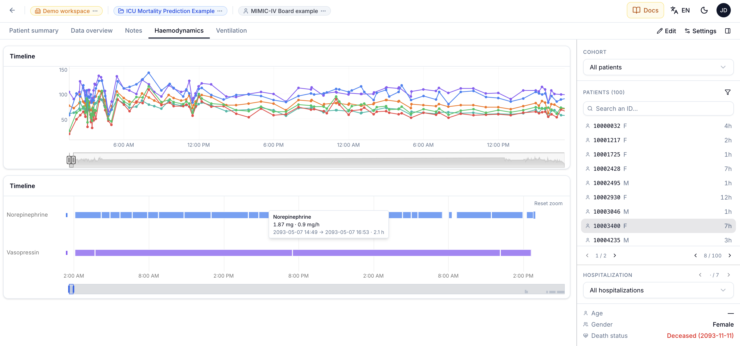
A board is organized into tabs, each holding a grid of resizable widgets. The Edit button opens editing — add a tab, add a widget, move, resize —, and Done closes it.
Four widgets ship with Linkr.
Patient summary
Demographics, age, sex, number of stays, and the list of hospitalizations with their span over time.
Timeline
Curves over time: vital signs, labs, doses. It is the only widget where you choose the concepts to plot.
Clinical notes
The reports, with full-text search and colour-highlighted word sets — “anticoagulants” in blue, “haemorrhage” in red, across every document.
Data overview
Everything the patient has, by table and by concept, as density bands. Excellent for spotting a gap in the record or a period with no data.
To which add warehouse plugins, which run R or Python to produce a bespoke display.
Choosing a timeline’s concepts
The concept picker is the same table as the Concepts page, with a Selected panel on the right where each concept carries its colour. Clicking the swatch opens the palette, with a Custom colour as a last resort.
The Add from a concept list button pulls in a list you built: its concepts are appended to the current selection, in list order, removing nothing. Concepts already selected therefore keep their colour — the new ones take the next ones in the rotation.
Click a row to tick or untick it.
Colour follows position in the selection
The automatic colour follows the order: red, blue, green, orange… Unticking then re-ticking a concept sends it to the end, so it changes colour. A colour picked by hand stays attached to the concept. No effect on the data, but worth knowing if you are comparing two screenshots.
Seeing and editing a widget’s SQL
A widget’s editor has a Code tab showing the query actually run. Useful to understand, and to check what is being counted.
For the Timeline and Clinical notes, that query can be edited by hand. Patient summary is read-only: its layout expects specific columns.
When the query cannot be built
Rather than an empty editor, Linkr shows what is missing from the schema mapping. That is almost always where the problem lies when a widget stays empty.
Manual collection
This is the feature that changes a retrospective study the most.
The principle: you declare variables to collect, an entry panel opens beside the record, and what you type is written into a dataset — the same one the Datasets page edits.
Why this matters
The usual method is a spreadsheet beside the clinical software, later retyped. Every retyping loses information and adds errors. Here the entry is the data: immediately traceable, exportable, and recorded in the dataset’s edit history.
Setting it up
The Set up manual collection window opens from the collection panel — the Set up collection button on a board that has none yet, then the settings icon at the head of the panel. It has four tabs.
Set up manual collection
Choose the dataset that receives what you type, and how its columns identify the patient. Entries are written straight into that dataset, so they can be edited, plotted and exported like any other data.
Create a new column, or collect one the dataset already has.
Dataset — you pick an existing dataset, or create one. Creating is the option to prefer: the new dataset is born with the identity columns — patient, hospitalization, stay — named the way the active database names them. It therefore joins to the warehouse without renaming.
Sections — headings to group the variables in the panel, in the order their arrows set. Purely visual: they create no columns, and deleting one leaves its variables in place, simply ungrouped.
Variables — the columns to fill in, each filed under a section. Add a variable creates a column; Use an existing column… collects a column the dataset already has, marked Existing. Each variable has a type, a label, a description, and can be required, limited to allowed values, or bounded by a minimum and a maximum. An allowed-values list becomes a dropdown at entry time, which rules out spelling variants. An out-of-range value, for its part, is flagged under the field without being refused: it is often a typo, but sometimes the real measurement.
General — saving, either automatic (each value is written as you leave the field) or manual (changes wait for your confirmation).
Two ways to remove a variable, which do not do the same thing
A variable created for the collection owns its column: deleting it removes the column from the dataset, along with the values already captured. Linkr asks for confirmation, stating how many values would be lost.
An existing variable — a column the dataset already had — is only removed from the collection: the column stays.
Using it
The panel opens from the Collection button, beside the record rather than over it: you read one while filling the other. Each section shows its progress — 2/3 — even when collapsed, and Expand all / Collapse all open or fold them all. A coloured dot on the button summarizes the current patient’s state.
Fill a field: the section counter and the button's dot follow.
Required.
Required.
- Grey — nothing collected for this patient yet.
- Amber — collection has started, but a required field is still empty.
- Green — every required field is filled. With no required field, a single value is enough.
With automatic saving, a value is written when you leave the field or press Enter. With manual saving, a dot flags each edited field, and Save — or Cmd+S — writes them all.
One row per patient, never two
Returning to a patient already captured updates their row instead of adding one. A collection is a form, not a journal. Switching patients clears unsaved changes: they belonged to the record you left.
Like any change to a dataset, an entry goes through the operation log: it can be undone, and it can be read back.
Limits worth knowing
- The patient list shows 50 patients per page.
- Data overview loads at most 4,000 events per query: beyond that, the density bands stay grouped rather than showing events one by one.
- A script widget runs on the server in server mode, and in your browser in browser mode.
Going further
- Cohorts — narrowing the patient list.
- Datasets — what the collection feeds.
- Concepts — finding the concepts to plot.
- Manual data collection — good practice, beyond the tool.