In short
Five statistical analyses are added as widgets, without writing code: descriptive table, tests, regression, survival, correlation matrix. You point at columns, they produce a table or a figure. The choice of test is guided by the data by default, and stays under your control.
The analyses available
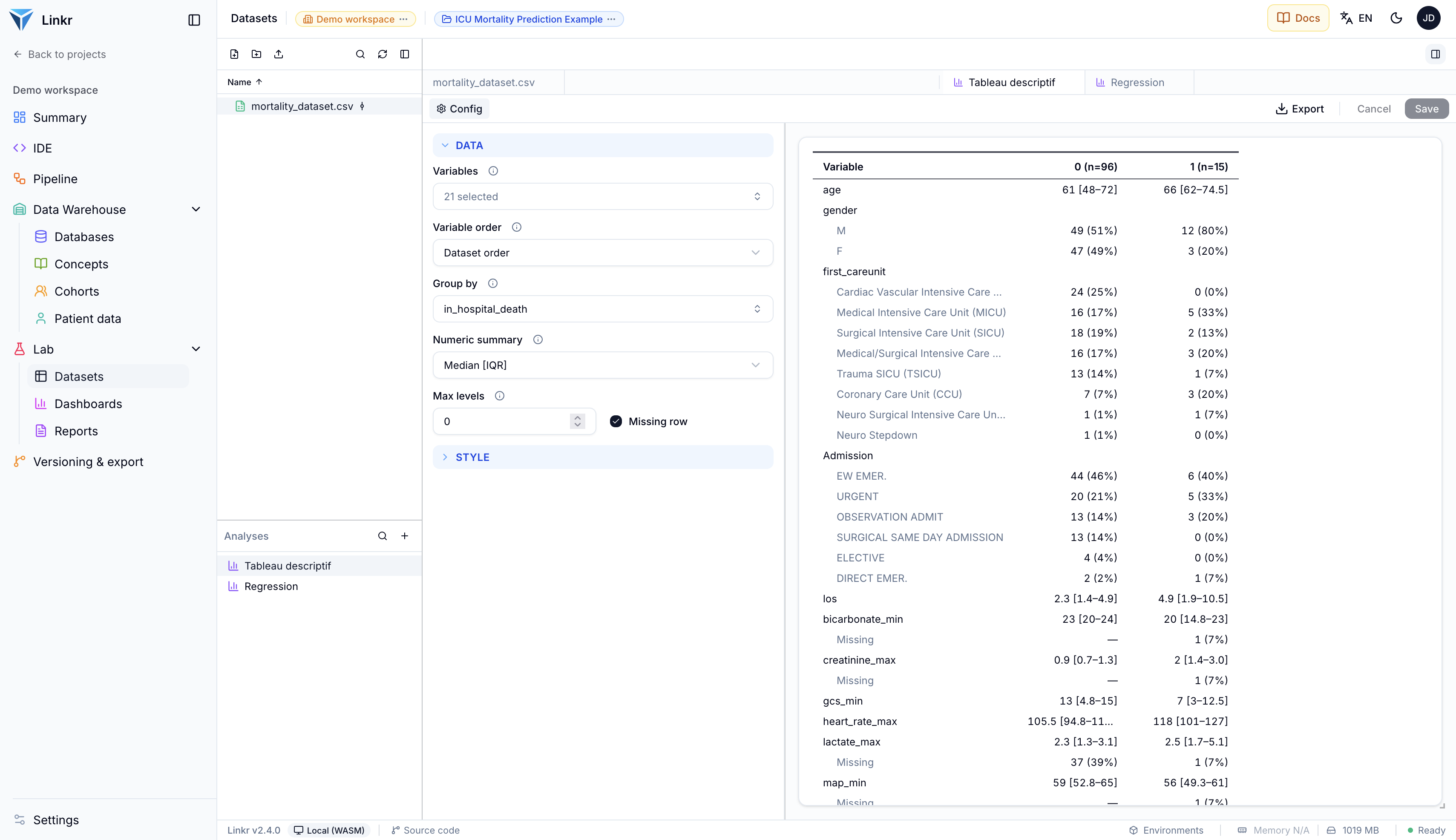
Descriptive table
The description of the population, variable by variable, optionally by group. The table that opens a paper.
Statistical tests
Comparing several variables between groups, each with the test that suits it.
Regression
Linear or logistic, with its coefficients, confidence intervals and forest plot.
Survival
Kaplan-Meier curves, log-rank test, at-risk table and a Cox model.
Correlation matrix
Pearson or Spearman, with significance.
Adding one
On a dashboard: Edit, then Add widget, Plugin tab. You pick the analysis, give it a name and a dataset, and configure it with a live preview.
The same list is reachable from a dataset’s analyses, without going through a dashboard — handy while exploring.
Each analysis has its documentation, inside the application
The Doc tab, next to the configuration, shows the analysis’s notes: what it computes, how to read it, and the methodological traps. That is often where the answer to “which test should I use?” lives.
The descriptive table
You choose the variables, and optionally a column to group by. Each variable produces a row: counts and percentages for a categorical variable, a numeric summary for a continuous one.
The numeric summary is adjustable: median and interquartile range (the default), mean and standard deviation, minimum/maximum, or range. You can add an overall column, a missing row, and reorder the variables by hand.
No p-value column here, deliberately
The descriptive table computes no p-values. In a randomised trial the CONSORT recommendation is explicit: a baseline imbalance is by construction due to chance, and a significant p there signals a randomisation failure, not a difference worth reporting.
In an observational study the risk is different but real: a table of thirty variables produces significant differences by the sheer number of comparisons. To compare two groups deliberately, use the Statistical tests widget, which shows the test used alongside its result.
| Characteristic | Survivors | Deceased | p |
|---|---|---|---|
| n | 2,847 | 711 | |
| Age, mean (SD) | 62.4 (15.1) | 71.8 (12.3) | <0.001 |
| Female, n (%) | 1,310 (46) | 291 (41) | 0.02 |
| SAPS II, med. [IQR] | 34 [26–44] | 52 [41–63] | <0.001 |
| Ventilation, n (%) | 996 (35) | 498 (70) | <0.001 |
Statistical tests
You point at a group column and the variables tested. Each variable gets the test that suits it, and the table shows what you choose to show: test name, statistic, degrees of freedom, p, 95% confidence interval, effect size, per-group descriptives.
| Variable | Test | Stat. | p |
|---|---|---|---|
| Age | Student's t | t = 9.2 | <0.001 |
| SAPS II | Mann-Whitney | U = 6.1e5 | <0.001 |
| Sex | χ² | χ² = 5.3 | 0.02 |
| Lactate | Mann-Whitney | U = 4.8e5 | 0.003 |
How the test is chosen
The Test choice setting offers three positions.
Auto — guided by the data
Normality is checked within each group. If it holds, a parametric test; otherwise a rank-based one. In case of doubt the choice leans non-parametric, which assumes less.
Force non-parametric
Mann-Whitney for two groups, Kruskal-Wallis beyond.
Force parametric
Welch’s t-test for two groups, ANOVA beyond.
Categorical variables follow their own rule: chi-squared, or Fisher’s exact test when the table is 2×2 and an expected count falls below 5 — where the chi-squared approximation stops being reliable.
Each test explains why it was chosen
The table shows the reason — for instance “2×2 table with an expected count below 5, where chi-squared’s approximation is unreliable — Fisher’s exact test instead.” A variable can also be given a pinned test of its own, which then overrides the general setting.
Regression and survival
Regression needs an outcome and some predictors. The type — linear or logistic — is detected, or forced. Adjustment is expressed by adding predictors: there is no separate field for it. The display is set to a table, a forest plot, or both.
Survival needs a time variable, an event variable and, if wanted, a group variable. It produces the curves, median survival, the at-risk table, and — by naming Cox predictors — a model with its assumption check.
Correlation matrix
A heatmap of the correlations between numeric variables, as a Pearson or Spearman coefficient, with significance optionally shown against an adjustable threshold.
| Age | SAPS II | Lactate | LOS | |
|---|---|---|---|---|
| Age | 1.00 | 0.42 | 0.18 | 0.31 |
| SAPS II | 0.42 | 1.00 | 0.55 | 0.48 |
| Lactate | 0.18 | 0.55 | 1.00 | 0.27 |
| LOS | 0.31 | 0.48 | 0.27 | 1.00 |
Exporting a result
Every analysis exports to PNG. Those producing a table — descriptive, tests, regression, survival — also offer copy as table or copy as LaTeX, which saves retyping numbers into a paper by hand.
At dashboard level, a bulk export produces the figures as PNG or SVG, with a choice of resolution.
There is no PDF export
Neither at analysis level nor at dashboard level. For a document, go through an image export, or wait for reports, which are designed for exactly that.
Where the computation happens
In browser mode the analysis is computed in your tab. In server mode it is computed on the server — and the rows never come down to the browser.
Displaying an analysis does not require the right to run code
The server receives no code: it owns the program for each analysis and accepts only a validated description of what to compute. A reader can therefore display these widgets with plain read access — unlike R and Python code widgets.
What does not exist yet
- A p-value column in the descriptive table, for the cases where it is legitimate.
- A stratified mode — a second grouping nested inside the first.
Going further
- Control charts (SPC) — tracking an indicator over time rather than comparing groups.
- Built-in widgets — charts and indicators without statistics.
- R and Python code — when no ready-made analysis fits.
- Datasets — the table these analyses work on.