In a nutshell
R is a language built for statistics and data analysis. Once data has been extracted with SQL, R is used to clean it, compute indicators and produce publication-quality charts and tables. It is very common in biostatistics and clinical research. You use it inside RStudio, a comfortable working environment, with a set of libraries called the tidyverse.
This article assumes you have gone through Why learn to code? and the introduction to SQL. SQL pulls data out of the database; R then takes over to analyse it.
Why R in clinical research
R was created by and for statisticians. That explains its popularity in healthcare:
- Statistical methods (tests, regressions, survival models…) are available natively or through proven libraries.
- The charts it produces are of excellent quality and widely accepted in scientific journals.
- It is often the language taught in medicine and public health, and therefore the one your future colleagues and supervisors use.
What is a library?
A library (or package) is a set of ready-made functions, written by others, that you add to R to extend its capabilities. You install them once with install.packages(“name”), then load them in each script with library(name).
RStudio, the working environment
You almost never write R “bare”. You use RStudio, a free application that gathers in a single window the code editor, the console that runs commands, the charts and the help. That is where you will spend all your time.
The tidyverse: filtering and transforming
The tidyverse is a set of libraries that makes R readable for beginners. Its central library, dplyr, provides a small vocabulary of verbs matching the SQL moves: filter() (filter rows), select() (choose columns), group_by() + summarise() (aggregate).
You chain them with the pipe |>, read as “then”: take the data, then filter, then group…
library(dplyr)

# From a `patients` table (person_id, sex, age, creatinine)
patients |>
filter(sex == "F", age > 65) |>      # then: keep women over 65
group_by(sex) |>                     # then: group by sex
summarise(
  n = n(),                           # number of patients
  mean_creat = mean(creatinine, na.rm = TRUE)  # mean creatinine
)| sex | n | mean_creat |
|---|---|---|
| F | 3 | 155.3 |
If you read the SQL article, you recognise the logic: it’s the same reasoning — filter, group, summarise — in a different syntax. The na.rm = TRUE option asks R to ignore missing values when computing the mean, a point covered in the article on data quality.
Visualising with ggplot2
ggplot2, another pillar of the tidyverse, builds a chart in layers: you declare the data, what goes on the x and y axes, then the type of plot.
library(ggplot2)

ggplot(patients, aes(x = age, y = creatinine)) +
geom_point() +                       # a scatter plot
geom_smooth(method = "lm") +         # a linear trend
labs(
  title = "Creatinine by age",
  x = "Age (years)",
  y = "Creatinine (µmol/L)"
)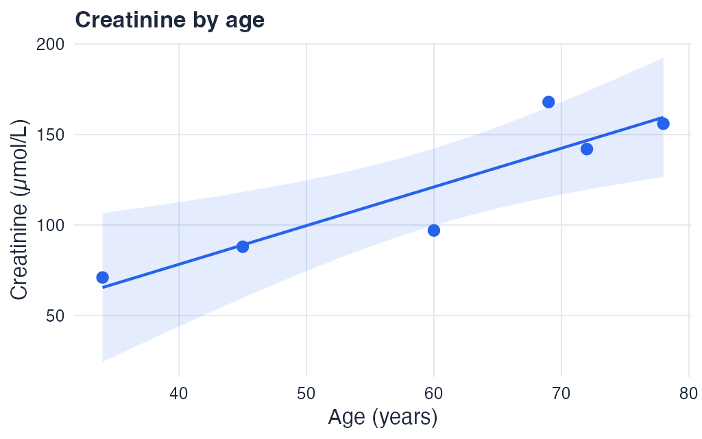
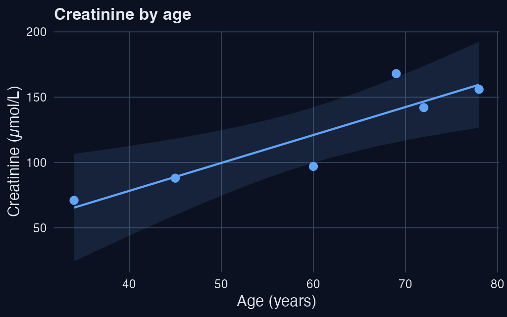
Each + adds a layer. You get a clean figure in a few lines, ready to export for a paper or a presentation.
Exploring a table
Before any analysis, you look at what the data is like. A few functions come up systematically:
head(patients)      # the first rows
summary(patients)   # min, max, mean, missing values per column
nrow(patients)      # number of rows
These three commands already give a good sense of a dataset’s structure and quality.
Resources to learn
What you'll learn
- The complete workflow: import, tidy, transform, visualise, communicate.
- Written by Hadley Wickham (creator of the tidyverse) and Mine Çetinkaya-Rundel, with exercises in each chapter.
- The reference to learn the tidyverse in depth.
What you'll learn
- The official path, from installing R and RStudio to your first charts.
- Ideal to start before tackling R for Data Science.
What you'll learn
- Teaches R from within R’s own console, interactively.
- You write real code from the first minute, with immediate feedback.
Recommended path for R
1. Install R and RStudio, then follow RStudio Education — Beginners for your first steps (~10 h). 2. Practise with swirl directly in the console. 3. Deepen your knowledge with R for Data Science, at your own pace.
Don't try to memorise everything
Nobody knows R by heart. You keep a cheatsheet at hand (the tidyverse cheatsheets are excellent) and look up the rest as you go. What matters is understanding the logic: filter, transform, visualise.
R and Linkr
The statistical analyses you design in the Study Designer — defining a population, computing variables — correspond to what you would do in R after extraction. Understanding R lets you extend an analysis beyond what a point-and-click tool offers, and verify your results.
- R is the language of statistics: ideal for analysing and visualising data once extracted with SQL.
- You work in RStudio, with the tidyverse — a set of libraries that make R accessible.
- The verbs
filter(),select(),group_by(),summarise()mirror the SQL logic;ggplot2builds charts in layers. - Resources: R for Data Science (free online), RStudio Education, and swirl.
- What matters is the logic — filter, transform, visualise — not memorising the syntax.