In a nutshell
Python is a highly readable general-purpose language that has become a data-science standard. Like R, it is used to clean, analyse and visualise data once extracted with SQL — through the pandas (data tables) and matplotlib (charts) libraries. It is also the dominant language in machine learning. You often use it in Jupyter notebooks.
This article follows on from Why learn to code? and the introduction to R. Python and R largely do the same things for data analysis; their concepts transfer from one language to the other.
Why Python
Python was not designed for statistics, but to be a general-purpose, readable language. That gives it strengths complementary to R’s:
- Versatility: beyond data analysis, Python is used to automate tasks, handle files, query websites, build applications.
- Machine learning: the major machine learning and artificial intelligence libraries (scikit-learn, PyTorch…) are in Python. It is unavoidable once you move towards predictive modelling.
- Readability: its clean syntax makes it a good first language, including for those who have never programmed.
R or Python?
Both are excellent choices to start with. R shines in biostatistics and statistical visualisation; Python is more versatile and unavoidable in machine learning. The most efficient path: start with the one your supervisors use, then discover the other when the need arises.
Jupyter notebooks
In data science, you often write Python in Jupyter notebooks: a document that alternates code cells, their results (tables, charts) and explanatory text. It is ideal for exploring data step by step and sharing a commented analysis. Free environments such as Google Colab let you use notebooks straight in the browser, with nothing to install.
pandas: working with tables
pandas is the central library for handling tabular data in Python. It organises data in an object called a DataFrame — a table with named rows and columns, like a spreadsheet.
import pandas as pd

# A table of patients (sex, age, creatinine)
patients = pd.DataFrame({
  "sex":        ["F", "M", "F", "F", "M", "F"],
  "age":        [72, 45, 34, 78, 60, 69],
  "creatinine": [142, 88, 71, 156, 97, 168],
})

# Filter women over 65
older_women = patients[(patients["sex"] == "F") & (patients["age"] > 65)]

# Mean creatinine by sex
patients.groupby("sex")["creatinine"].mean()sex F 134.25 M 92.50 Name: creatinine, dtype: float64
If you read the SQL and R articles, you recognise the same logic: filter rows, group, summarise. Only the syntax changes. In practice, you often load the data from a CSV file (a text table where columns are separated by commas) with pd.read_csv("patients.csv"), a very common exchange format.
matplotlib: visualising
matplotlib is the base library for plotting charts. Most plots fit in a few lines.
import matplotlib.pyplot as plt

plt.scatter(patients["age"], patients["creatinine"])
plt.xlabel("Age (years)")
plt.ylabel("Creatinine (µmol/L)")
plt.title("Creatinine by age")
plt.show()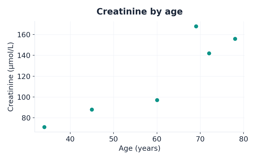
Exploring a dataset
As in R, a few commands come up at the very start of an analysis to understand the data:
patients.shape       # (number of rows, number of columns)
patients.info()      # type and count of non-missing values per column
patients.describe()  # min, max, mean, quartiles of numeric columns
These three lines give a first picture of the structure and data quality.
Resources to learn
What you'll learn
- The language foundations: variables, conditions, loops, functions.
- Accessible to complete beginners, recommended by our students.
- Budget around ten hours rather than the six advertised if you start from scratch.
What you'll learn
- Manipulate tables (DataFrames): select, filter, group, compute statistics.
- Use-case-driven tutorials (“how to select a subset”, “how to calculate statistics”).
What you'll learn
- Build your first charts: scatter plots, line charts, histograms.
- Many ready-to-adapt examples for your own data.
Recommended path for Python
1. Learn the language with the OpenClassrooms course (~10 h), writing code in Google Colab (nothing to install). 2. Continue with pandas to manipulate tables, then matplotlib to visualise. 3. Machine learning comes later, in the dedicated section on AI in healthcare — introductory courses (like Andrew Ng’s on Coursera) are more than enough to begin.
Python and Linkr
Once your data is extracted from a warehouse — in OMOP format, for example — Python and pandas are an excellent choice for extending the analysis beyond what the Study Designer generates automatically. The two approaches are complementary: the tool to design and frame, the code to explore without limits.
- Python is a versatile, readable, general-purpose language, a data-science standard and dominant in machine learning.
- pandas handles tables (DataFrames); matplotlib plots charts — same logic as SQL and R, different syntax.
- You often work in Jupyter notebooks (or Google Colab, in the browser).
- Resources: an introductory Python course for the basics, then the official pandas and matplotlib tutorials.
- Coding foundations first; machine learning later, in the dedicated section.