Linkr
Home Resources Tools Documentation Blog Demo
FR
Use cases
  • Explore a health data warehouse
  • Analyse the data
  • Build a dashboard
  • Collect and analyse a survey
Demo

Explore a health data warehouse

The “ICU Mortality Prediction Example” demo project holds 100 complete patient records from MIMIC-IV. This page walks through the four data warehouse screens, from the raw database to the individual patient record.

Open this page in the demo
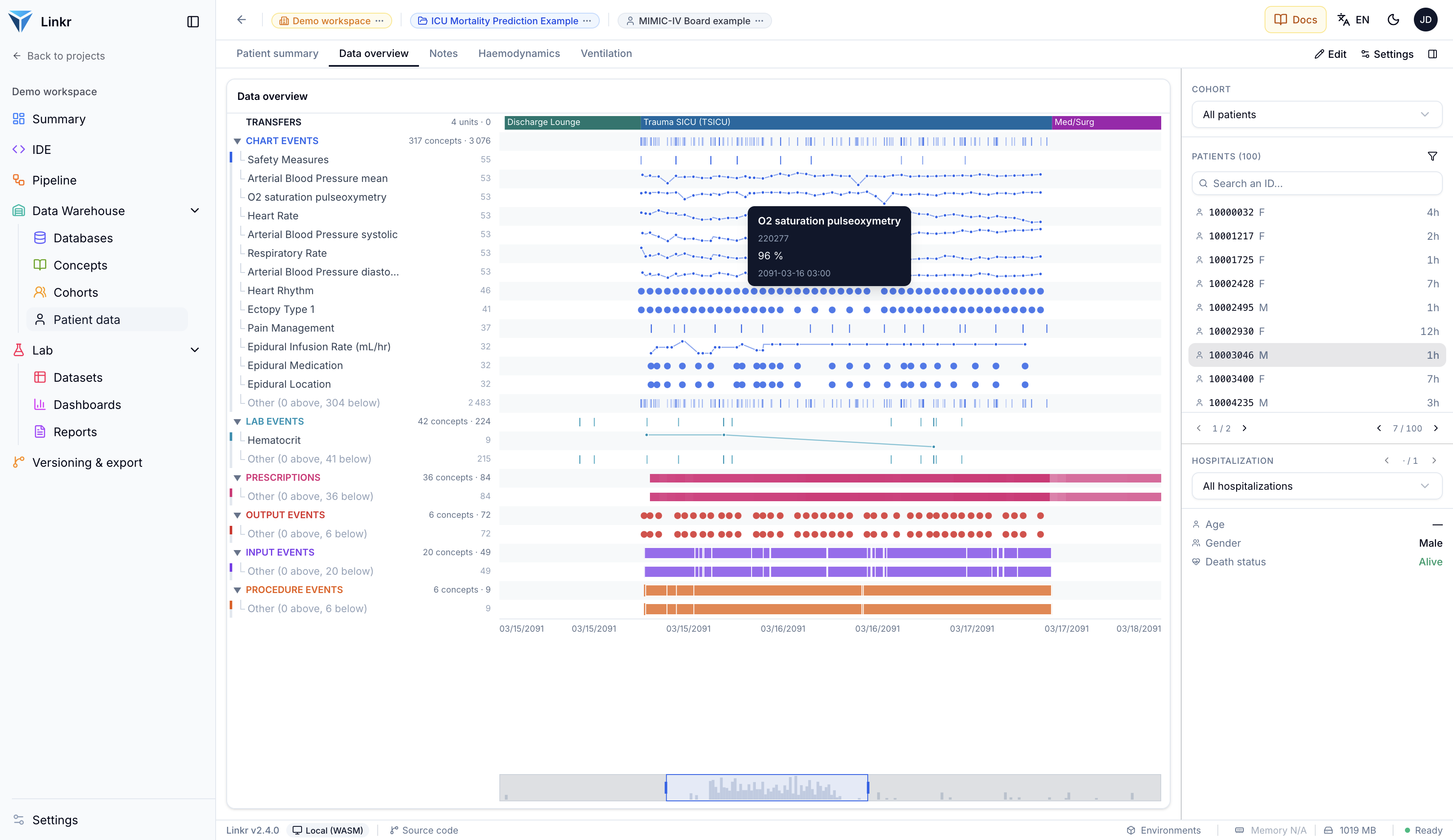
Where this page leads: one patient's entire record on a single timeline — 317 concepts and 3,076 measurements, grouped by category. Click to enlarge.

Summary

A project's data warehouse gathers read-only clinical data and makes it explorable without writing a line of code. It has four screens: Databases (what is plugged in and what it holds), Concepts (the dictionary of measured variables), Cohorts (selecting a population from criteria) and Patient data (one patient's record, rebuilt as a board of widgets).

Every screenshot below comes from the ICU Mortality Prediction Example project, available in the public demo. The data is the MIMIC-IV Demo — 100 real intensive care stays, de-identified and published by MIT. Click any screenshot to enlarge it.

Stay dates are shifted by roughly a century (you will see admissions in 2091): this is MIMIC's de-identification method, which preserves durations and the intervals between events while making the real dates unusable.

Databases

A project does not store data itself: it connects to one or more databases declared in the workspace. The Databases screen lists those feeding the project, with their connection status and licence.
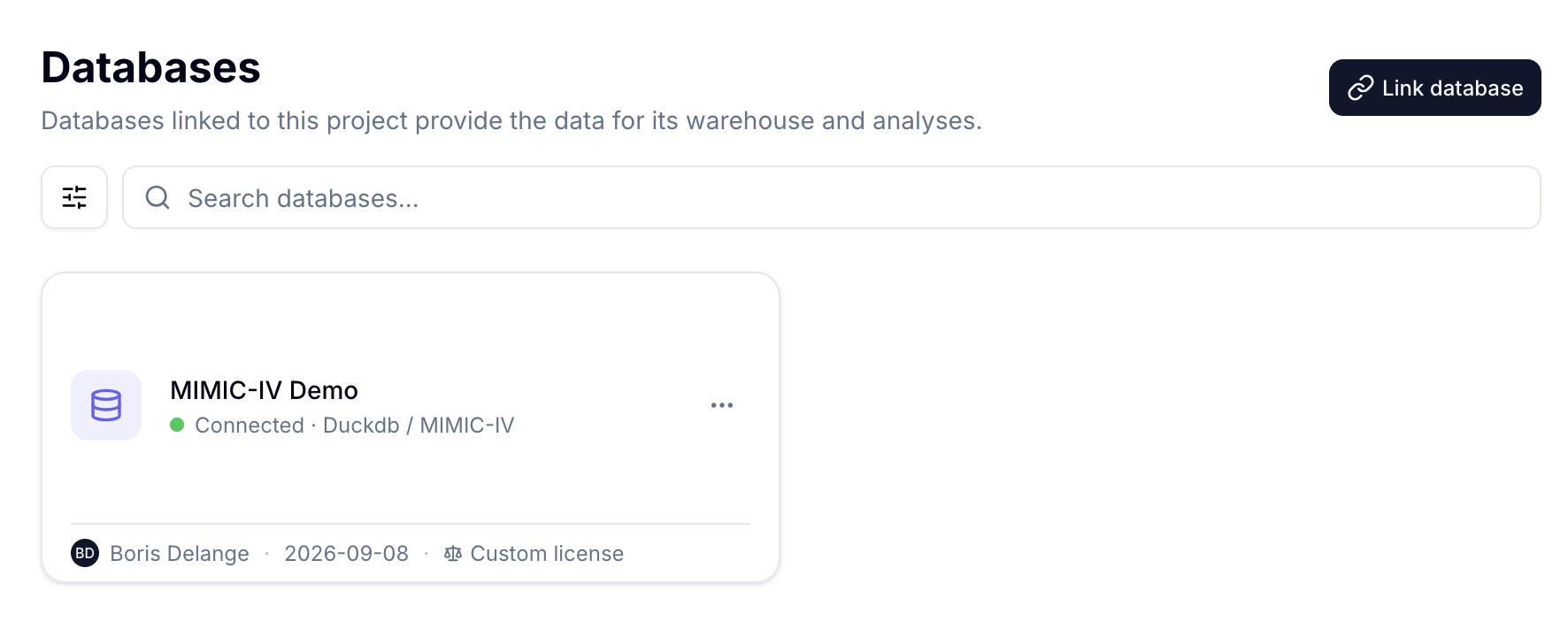
The MIMIC-IV Demo database, connected to the project. The format (Duckdb) and schema (MIMIC-IV) appear under the name.

Opening a database, the Statistics tab gives an immediate overview of its contents: patient count, gender split, number of hospitalizations and unit stays, mean and median durations, and the admission curve over time.
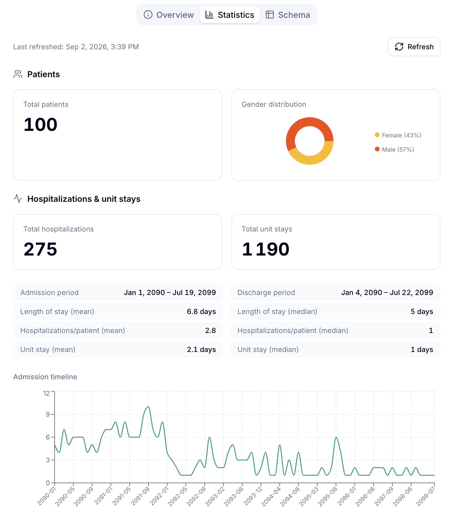
MIMIC-IV Demo statistics: 100 patients, 275 hospitalizations, 1,190 unit stays. The admission curve spans the whole period covered by the database.

The Schema tab next to it describes the tables and their columns — useful for understanding how the database is laid out before writing a query.

Concepts

A concept is a measured variable: a respiratory rate, a drug, a diagnosis. The Concepts screen is the dictionary of everything the database holds — 5,636 concepts here — each with the number of patients involved and the number of records.
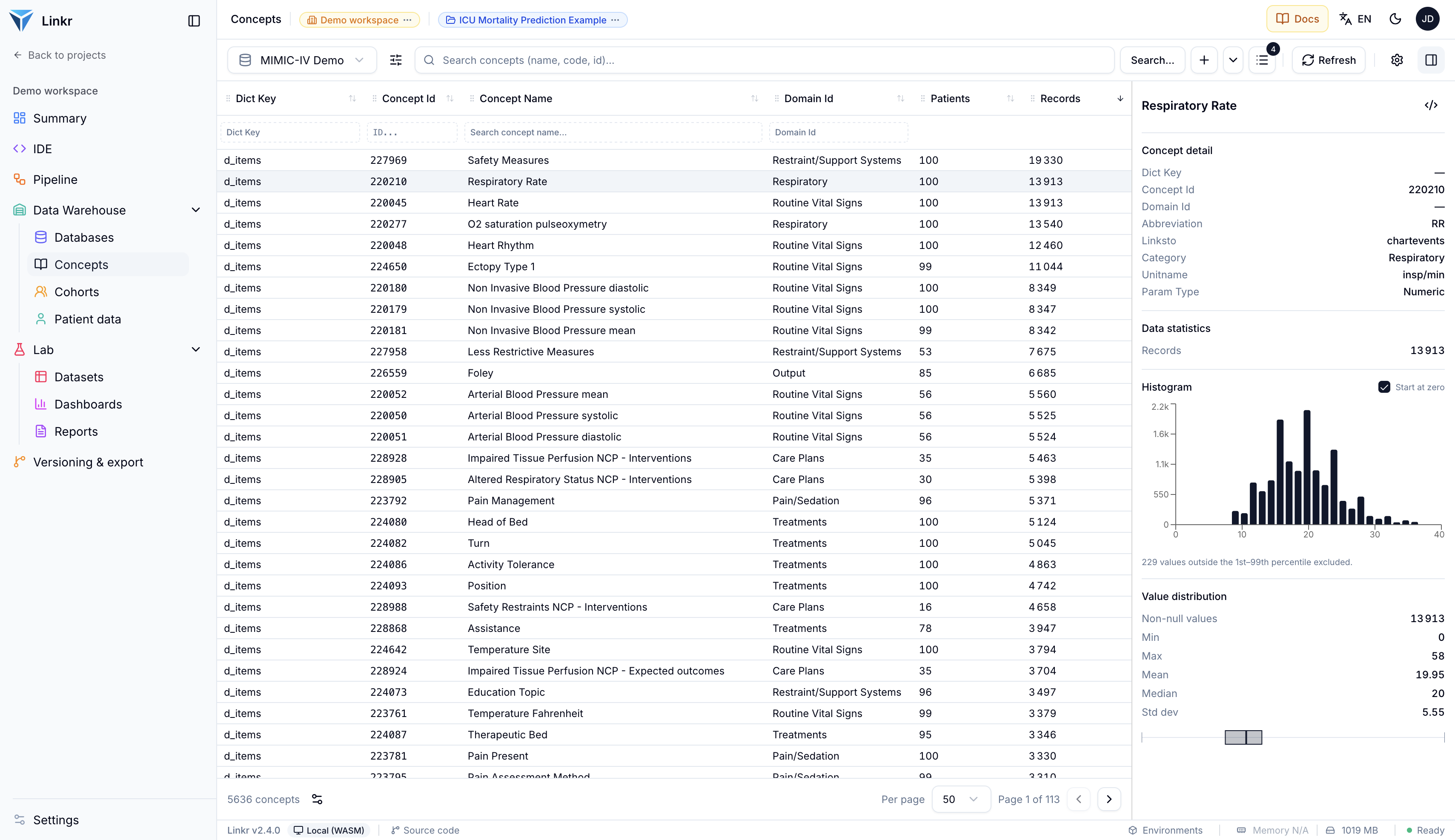
The concept dictionary, sorted by record count. The right-hand panel details the selected concept: here Respiratory Rate, 13,913 measurements, with its histogram and distribution.

This is the screen that answers the questions asked before any analysis: is this variable measured in enough patients? Are its values plausible? The right-hand panel shows the histogram, mean, median and standard deviation, making an inconsistent unit or an outlier visible at a glance.

Columns can be resized, reordered and filtered, and every filter is applied as SQL directly against the database — paging stays fluid even across millions of rows.

Cohorts

A cohort is a population defined by inclusion criteria. You build it without SQL, by stacking criteria combined with AND.
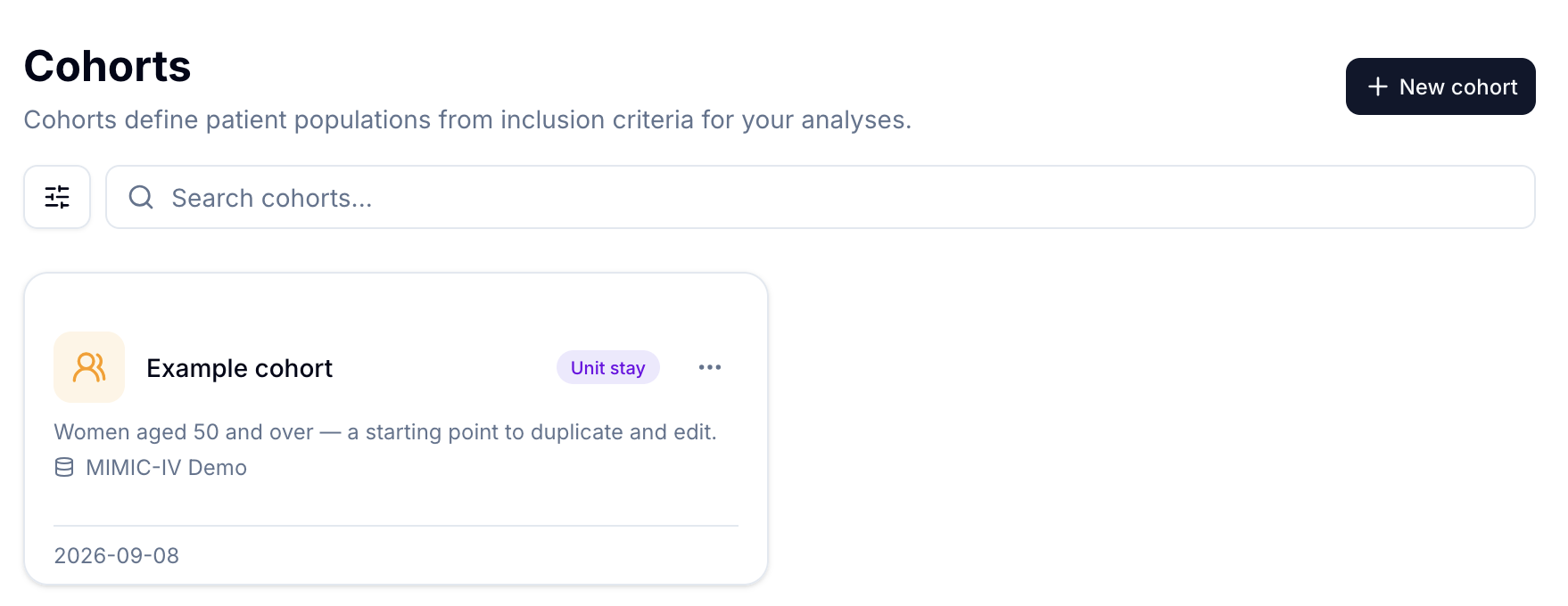
The project's example cohort: women aged 50 and over. The badge shows the granularity — here one row per unit stay.

In the builder, each criterion is a card: an age (at admission or current), a sex, a vital status, and many more. The NOT toggle inverts a criterion — in the example below it is used to exclude deceased patients.
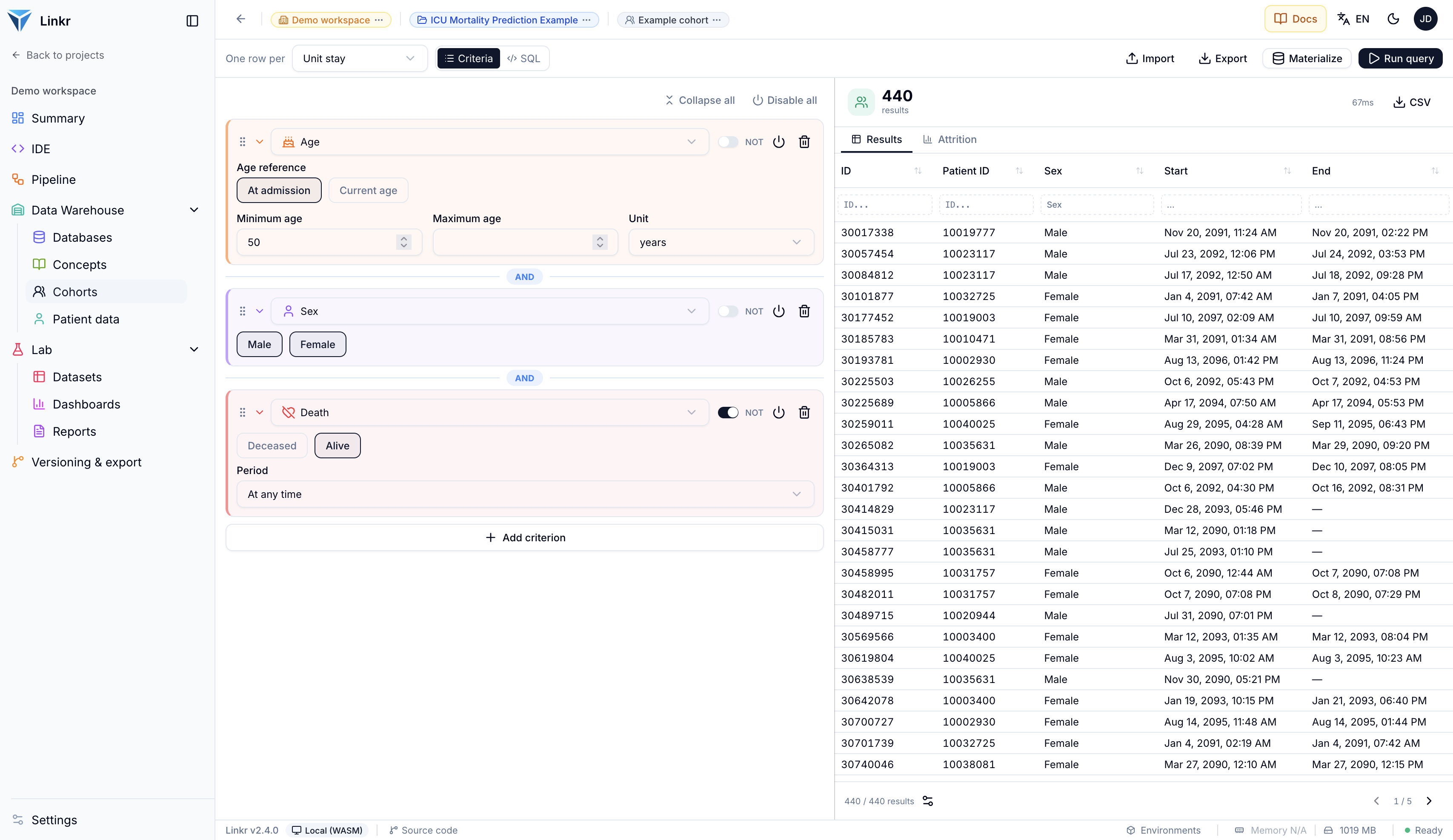
Three criteria combined: age ≥ 50, sex, and vital status inverted with NOT. The 440 matching stays appear immediately on the right, in 67 ms.

The result is computed on the fly. Two details are worth pointing out: the Attrition tab shows how many patients each criterion removes, and the SQL button reveals the generated query — handy to check the definition, or reuse it elsewhere. The cohort then becomes a reusable filter across the rest of the project.

Patient data

The three previous screens reason about populations. Patient data does the opposite: it rebuilds one patient's record. A project can hold several boards, each assembling its own widgets.
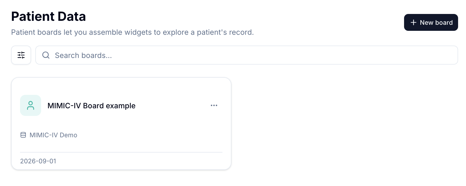
The “MIMIC-IV Board example”, shipped with the demo project.

A board is organised into tabs. The demo one has five: Patient summary, Data overview, Notes, Haemodynamics and Ventilation. The right sidebar stays constant: it selects the cohort, then the patient, then the hospitalization to display.
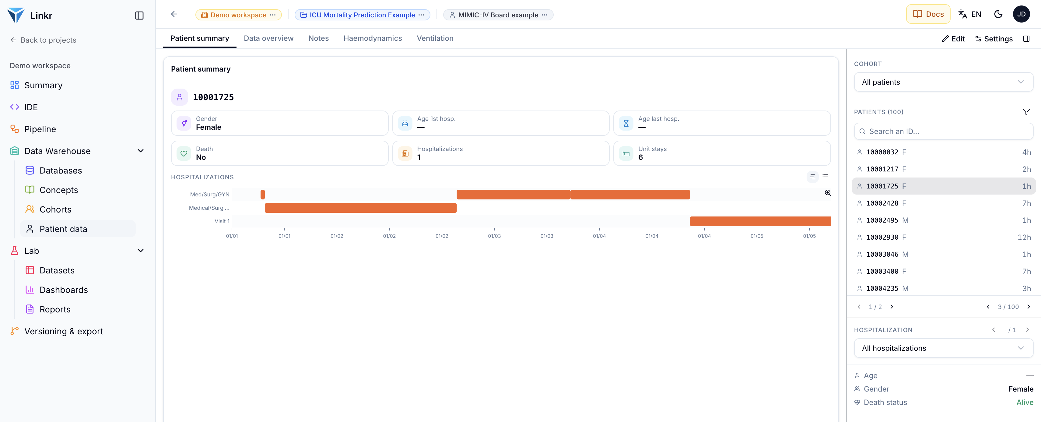
The Patient summary tab: identity, vital status, number of hospitalizations and unit stays, then the timeline of hospitalizations and the units the patient went through.

The Data overview tab answers a question that is hard to address any other way: what was actually measured in this patient, and when? Each row is a concept, each point a measurement, all aligned on a shared timeline and grouped by category — vitals, labs, prescriptions, inputs, outputs, procedures.

Data overview: 317 concepts and 3,076 measurements for this stay. The coloured band on top marks the care unit, and hovering a point shows its dated value.

The following tabs are thematic. Haemodynamics overlays circulatory vitals and, below them, the vasopressors administered — both share the same time axis, so a dose can be read against its effect.
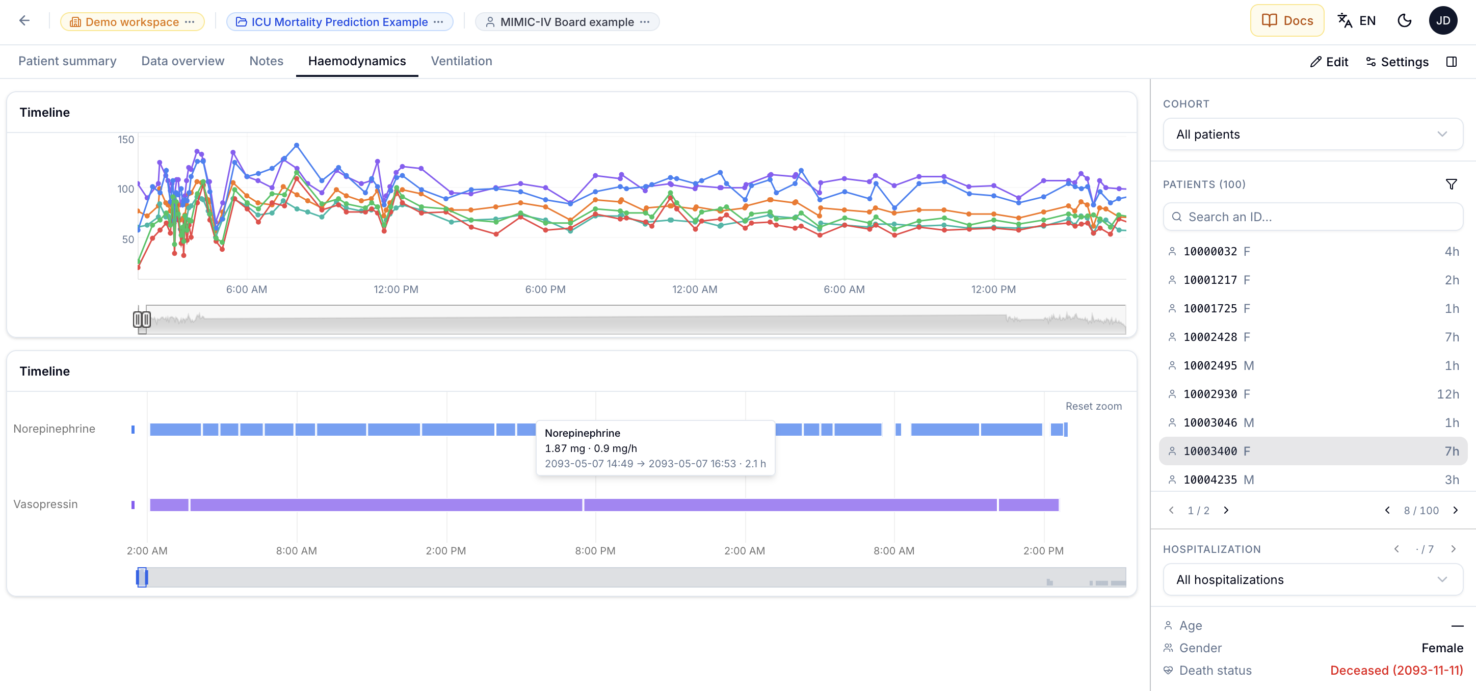
Haemodynamics: vitals on top, norepinephrine and vasopressin below. Hovering an infusion gives the dose, rate and duration.

Building your own widget

These tabs are not fixed: the Edit button opens edit mode, where you add tabs and widgets. The first step is choosing the concepts the widget displays, in the same table as the Concepts screen — with the same statistics at hand to check a choice before confirming it.
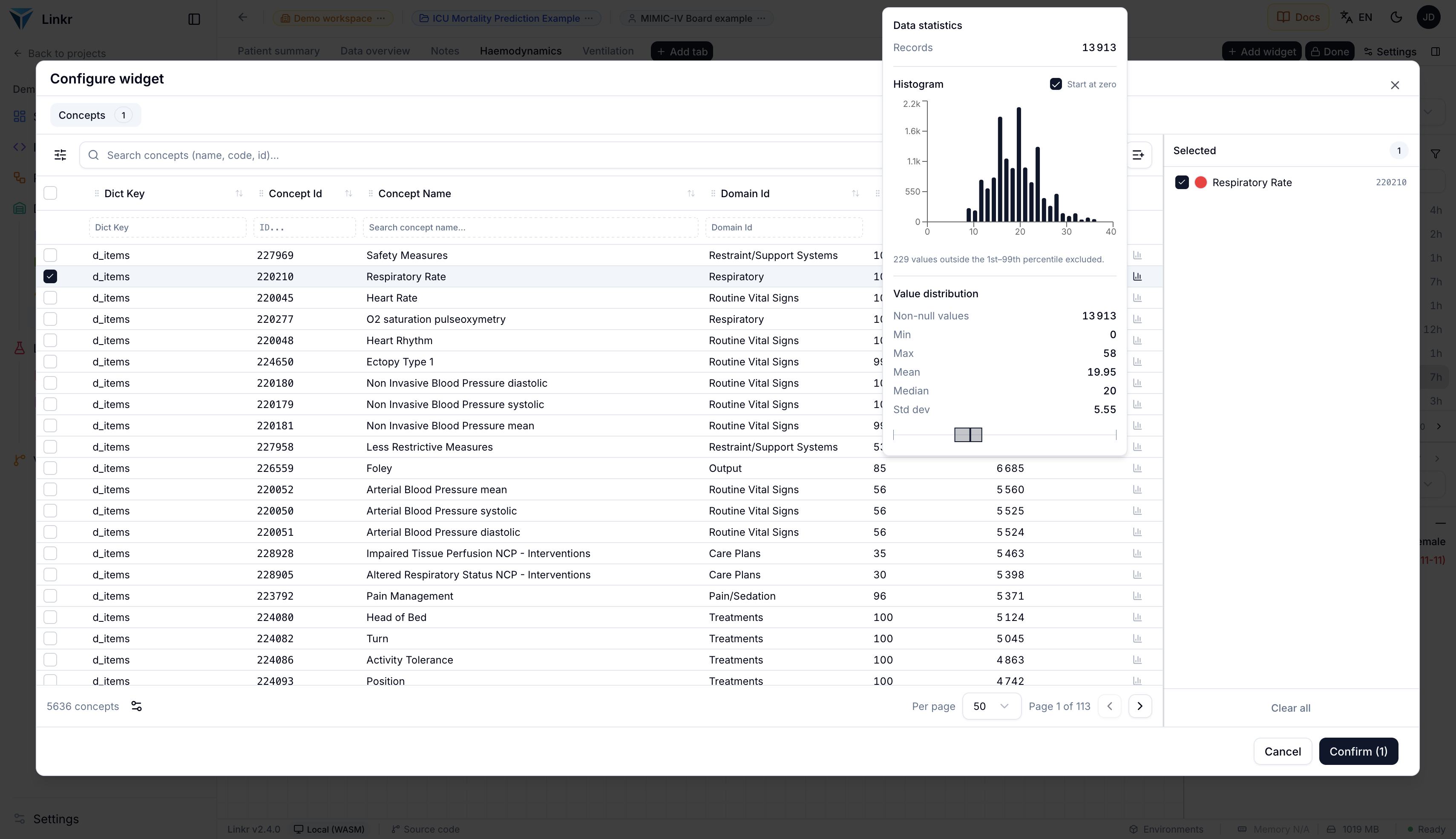
Picking the concepts: here Respiratory Rate, with a preview of its distribution to confirm the selection.

Then comes the widget's own configuration: its name, the renderer, and the display options — Y axis starting at zero, step plot, line thickness. The preview on the right updates live, using the selected patient's real data.
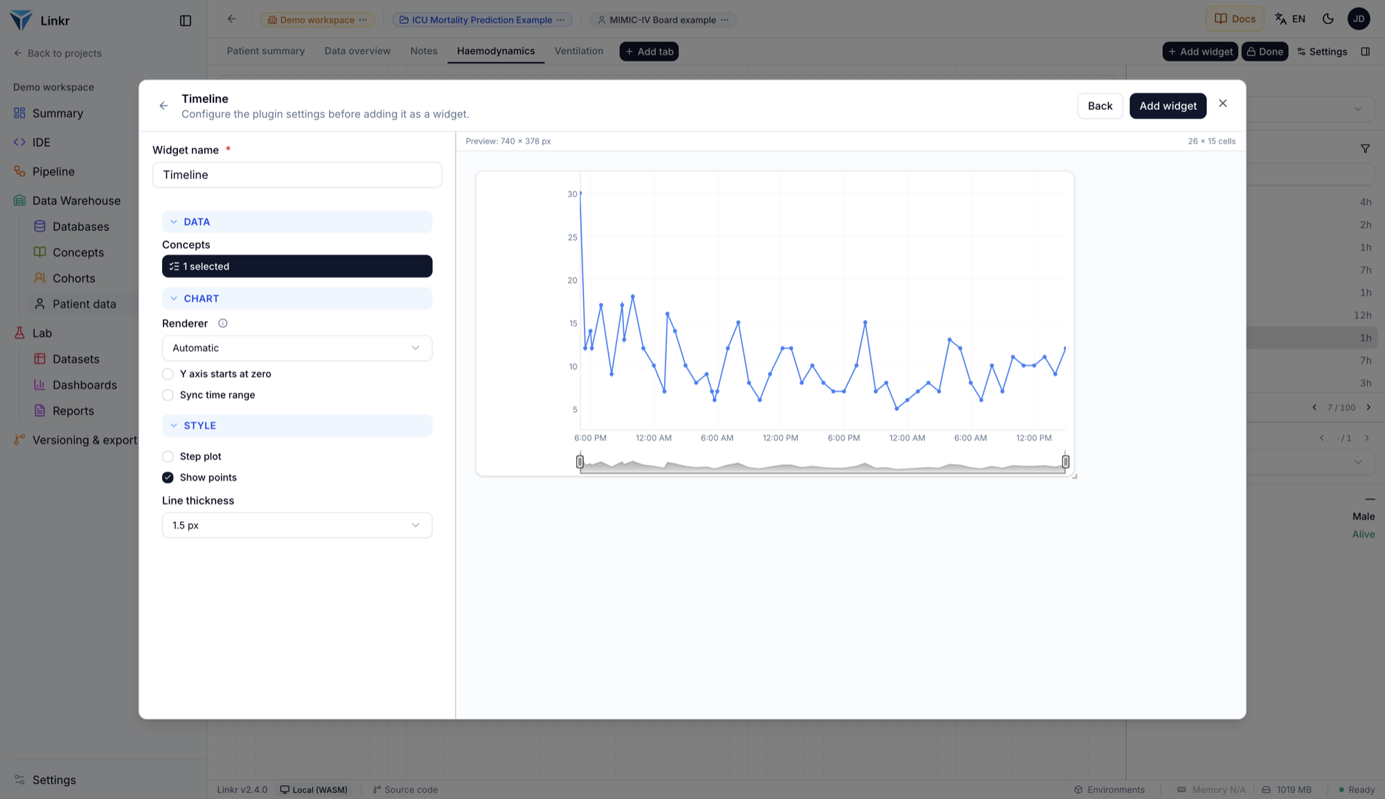
Configuring the Timeline plugin, with the live preview on the right. The widget is added to the tab with “Add widget”.
Everything you change in the demo stays in your browser: nothing is sent to a server. Those changes are kept between visits — to get back to the original project, use Reset all data in the user menu.

Going further

  • The MIMIC-IV database — where this data comes from, what it contains and how to get real access to it.
  • Quickstart in the browser — run through the same journey on your own data.
  • Health data warehouses — the concept, its uses and its limits.
Open this page in the demo
NextAnalyse the data

Product

  • Home
  • Demo

Resources

  • Documentation
  • Resources
  • Tools
  • Blog

Community

  • Framagit source code
  • Github source code

About

  • InterHop.org
  • Contact

2021–2026 InterHop — CC BY-NC-SA 4.0 (site) · GPLv3 (software)