Linkr
Home Resources Tools Documentation Blog Demo
FR
Use cases
  • Explore a health data warehouse
  • Analyse the data
  • Build a dashboard
  • Collect and analyse a survey
Demo

Build a dashboard

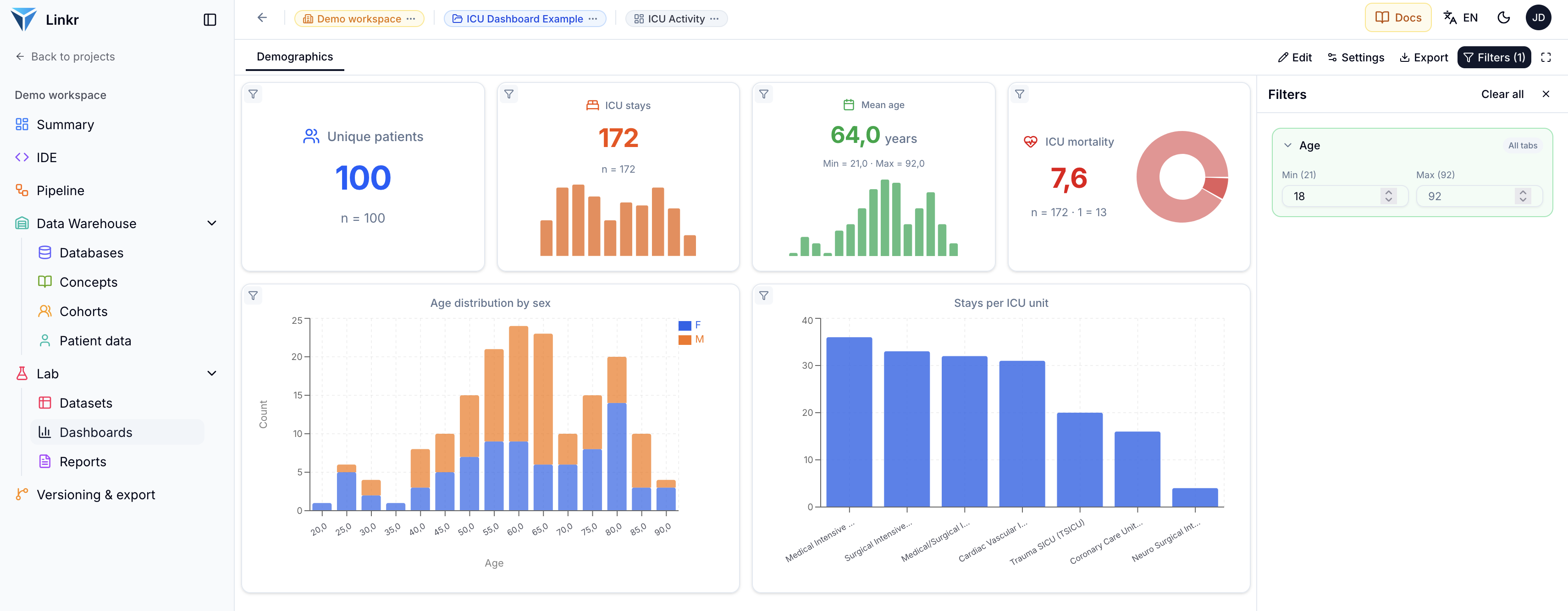
The “ICU Dashboard Example” project assembles indicators, charts and filters on top of an intensive care activity dataset. This page shows how a dashboard is built, widget by widget.

Open this page in the demo
The ICU Activity dashboard: four indicators on top, two charts below, and the filter panel on the right. Click to enlarge.

Summary

A dashboard is built on a dataset, by placing widgets on a grid. Each widget is a plugin configured through a form — key indicator, chart, descriptive table, statistical test — and filters declared once apply to every widget at once.

No code is required. The demo dashboard tracks the activity of an intensive care unit: how many patients, what ages, which units, what mortality.

The dataset

A dashboard does not read the database directly: it builds on a dataset. This one, icu_activity.csv, holds 1,810 rows describing intensive care stays — identifiers, sex, age, admitting unit, dates.
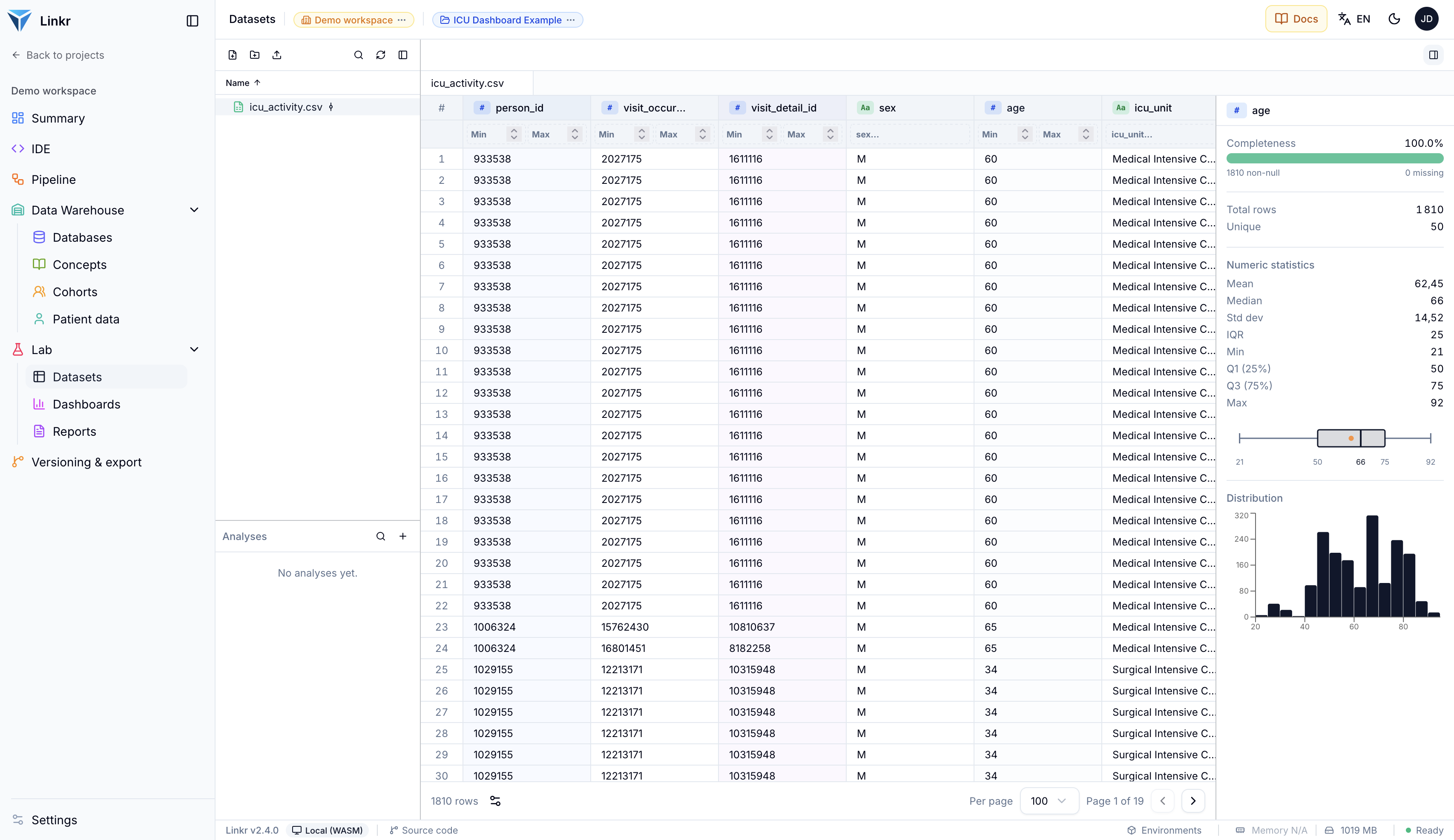
icu_activity.csv: 1,810 rows, one per stay. The age column is 100% complete, with a median of 66.
Several rows can belong to the same patient — hence the distinction, in the indicators, between the number of stays (172) and the number of unique patients (100).

Dashboards

A project's dashboards are listed under Lab → Dashboards. A project can hold several — one per purpose, per unit, or per audience.
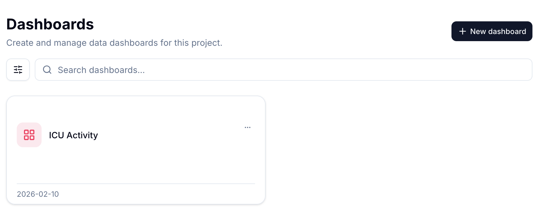
The ICU Activity dashboard, shipped with the demo project.

When opened, the dashboard is organised into tabs — here a single one, Demographics — each holding its own grid of widgets. The Edit button switches to edit mode, Export exports the dashboard, and the fullscreen icon turns it into a presentation.

Adding a widget

In edit mode, Add widget opens the plugin library. Each one answers a specific display need, and all of them ship with the application.
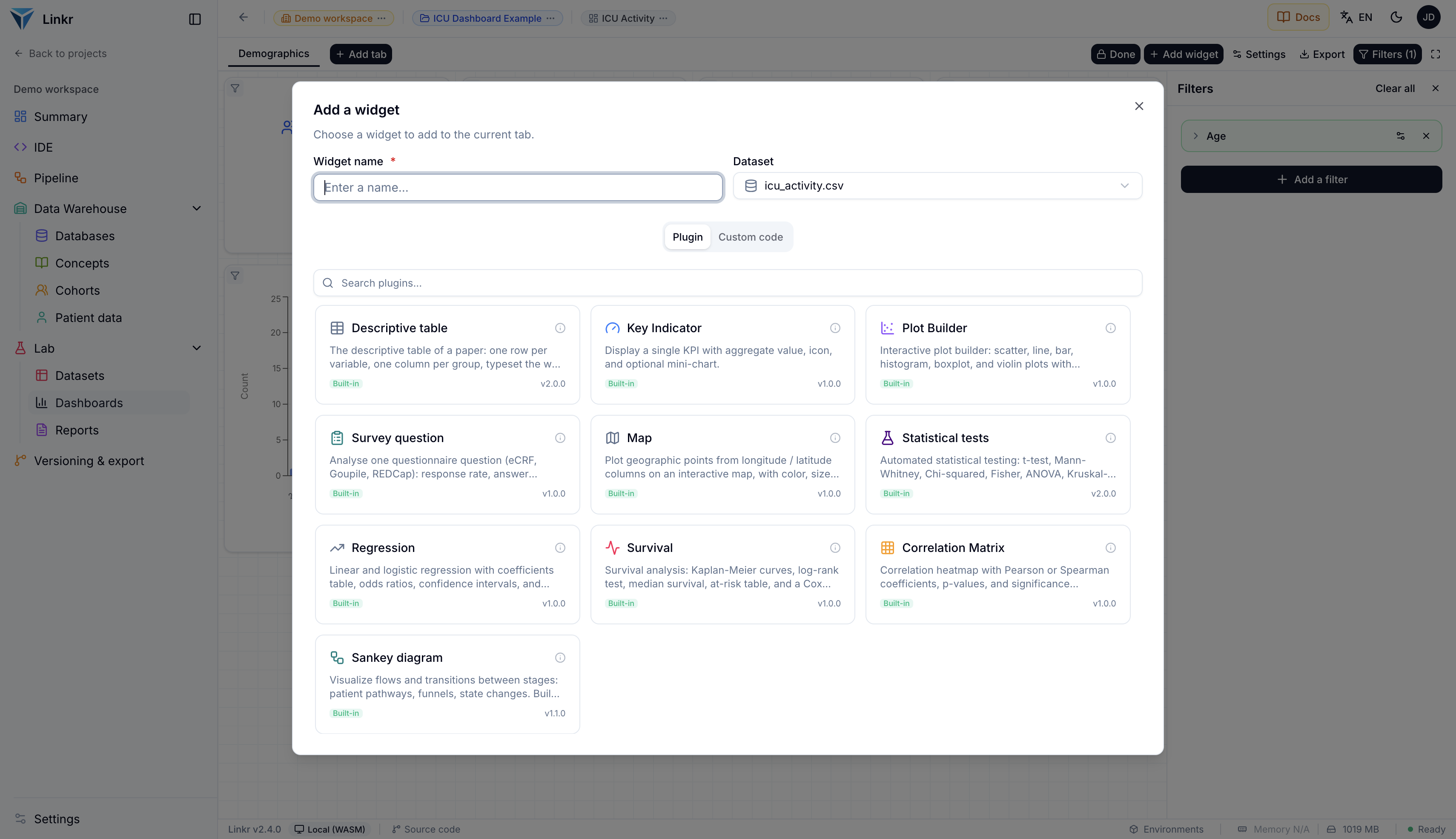
The built-in plugins: key indicator, plot builder, descriptive table, statistical tests, regression, survival, correlation matrix, Sankey diagram, map, and survey question.

The Custom code tab, next to Plugin, lets you write your own widget when no plugin fits — but most needs are covered without going there.

Once a plugin is chosen, its configuration form opens with a live preview on the right, computed on the real data.
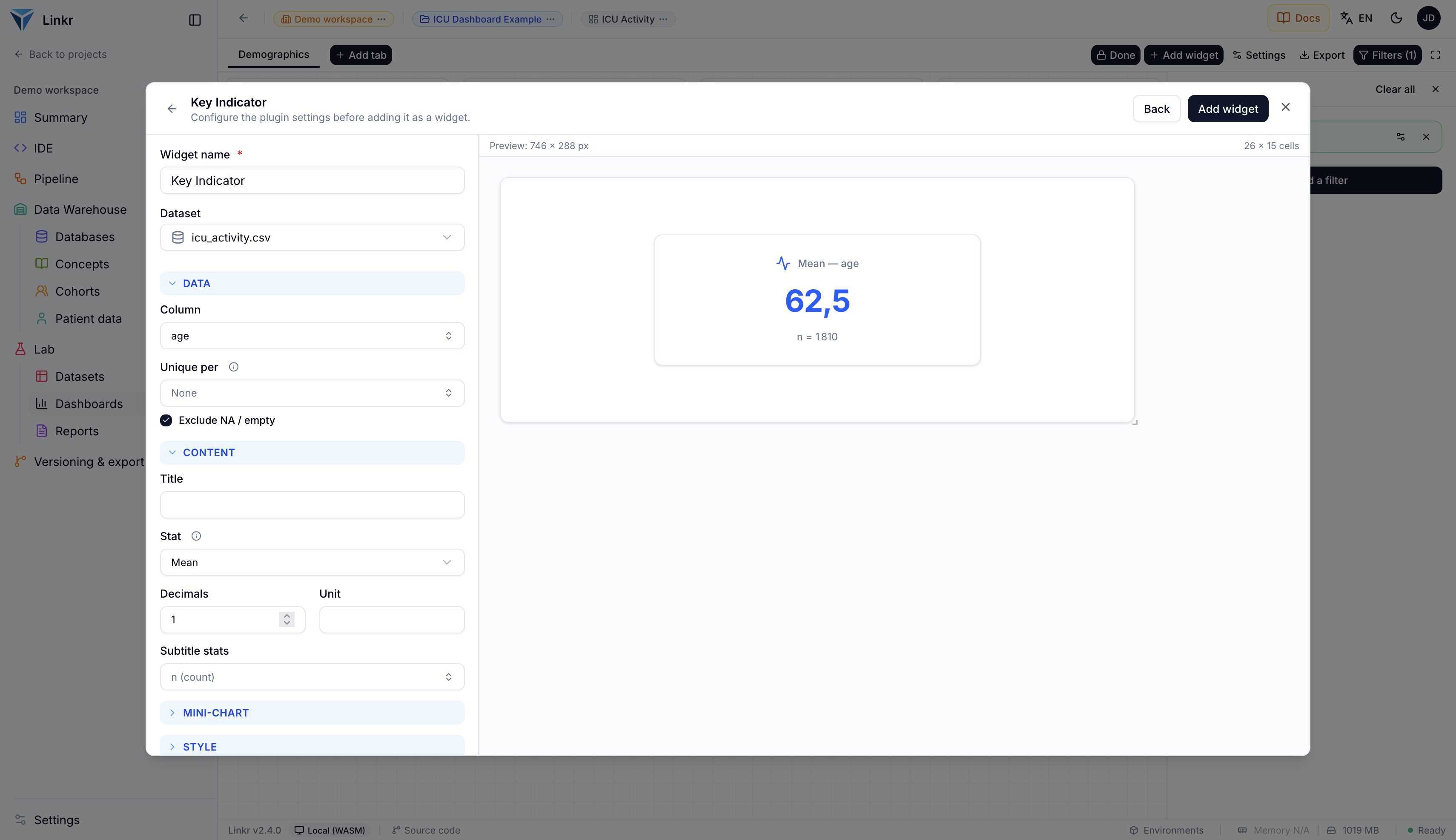
Configuring a key indicator: the age column, the Mean statistic, one decimal, and the n (count) subtitle. The preview shows 62.5 years over 1,810 rows.

An indicator therefore comes down to three choices: the column, the statistic (mean, median, count, sum…) and the formatting. The Unique per option counts distinct values of a column — that is what turns 1,810 rows into 100 unique patients.

Filters

The Filters panel on the right is what turns a collection of charts into a dashboard. A filter is declared once — here an age range from 18 to 92 — and applies to every widget at the same time.

The All tabs label means the filter follows the reader from one tab to the next. A widget can also be frozen so it ignores filters, which keeps a reference value beside a filtered view.

Widgets can be moved and resized with the mouse in edit mode. The grid is shared by all of them, which keeps the alignment clean with no manual adjustment.

Going further

  • Analyse the data — where the datasets feeding a dashboard come from.
  • Dashboard documentation — the full reference for widgets and filters.
  • Collect and analyse a survey — the same widget engine, applied to eCRF data.
Open this page in the demo
PreviousAnalyse the dataNextCollect and analyse a survey

Product

  • Home
  • Demo

Resources

  • Documentation
  • Resources
  • Tools
  • Blog

Community

  • Framagit source code
  • Github source code

About

  • InterHop.org
  • Contact

2021–2026 InterHop — CC BY-NC-SA 4.0 (site) · GPLv3 (software)