In this tutorial, we will see how to:
- Launch a project that's already installed
- Visualize data and concepts from a dataset
- Organize data by creating tabs and widgets
This is the multi-page printable view of this section. Click here to print.
In this tutorial, we will see how to:
At the end of this tutorial, you will have a dashboard allowing you to visualize data from 100 patients.
You must have previously installed and launched LinkR.
When installing LinkR, the following were installed:
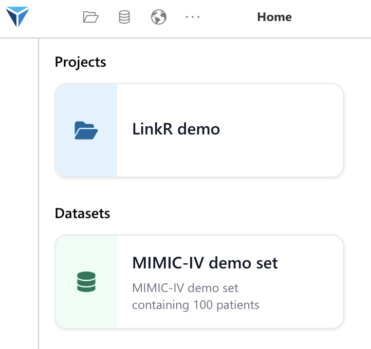
To launch the project, click on it directly from the home page (LinkR Demo Project).
Two things then happen:
You arrive at the project’s home page:
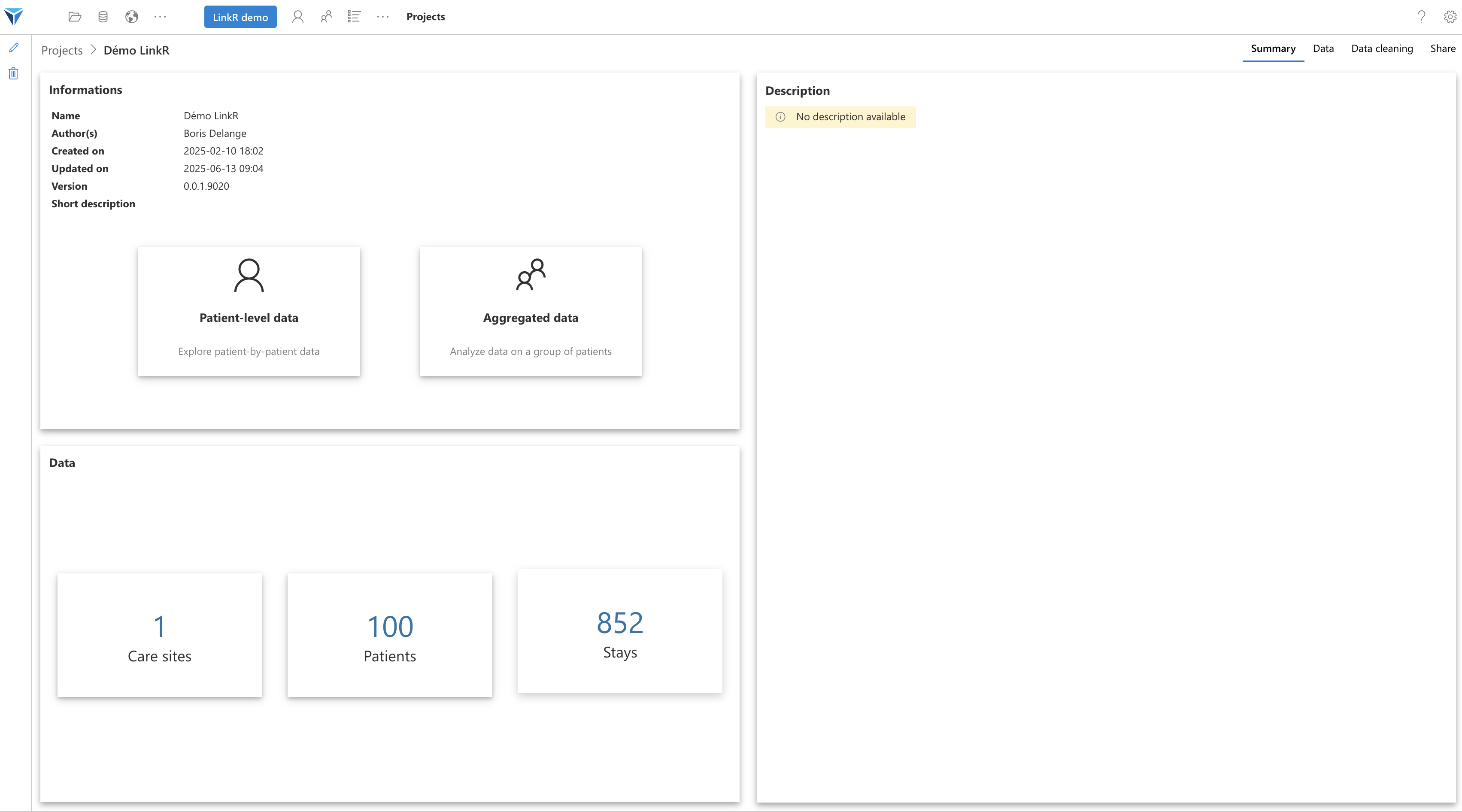
You have information about:
To access patient records, click on the “Patient-level Data” icon.
You will see dropdown menus on the left side of the screen: Subset, Patient, and Stay.
Select the subset “All patients”, and any patient.
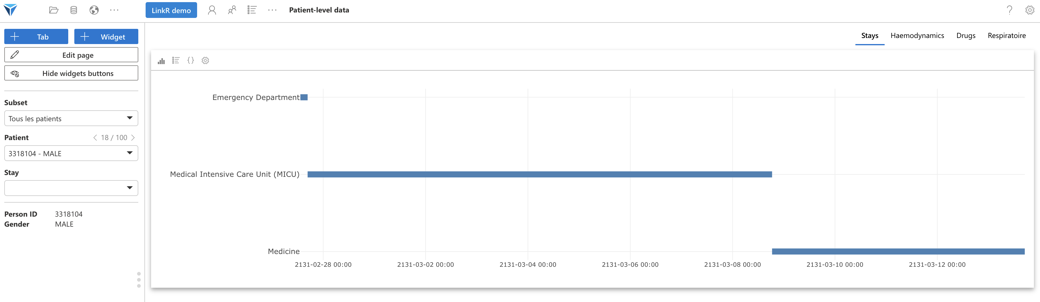
You will then see the patient’s stays. Here we see an emergency room visit, followed by an intensive care stay and a transfer to a medical unit.
Note the tabs at the top right of the screen, which allow you to organize the medical record.
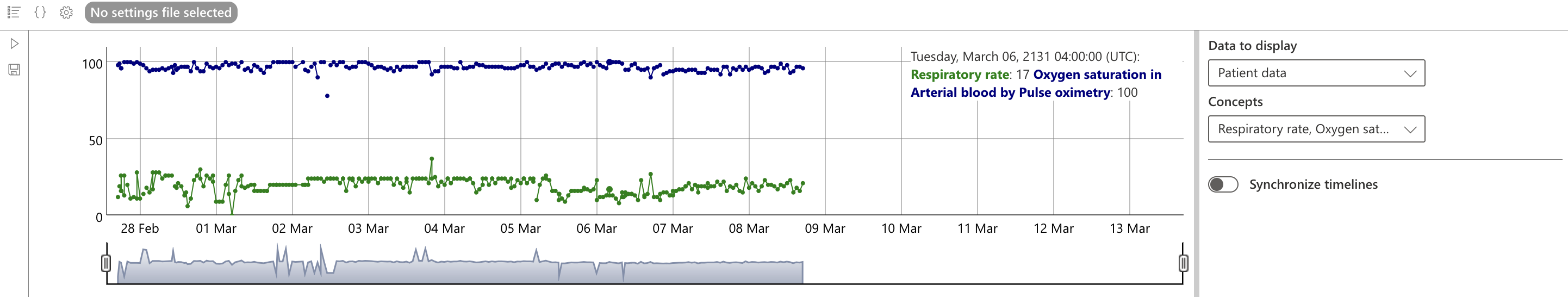
Click on the “Haemodynamics” tab to access data concerning the patient’s hemodynamics.
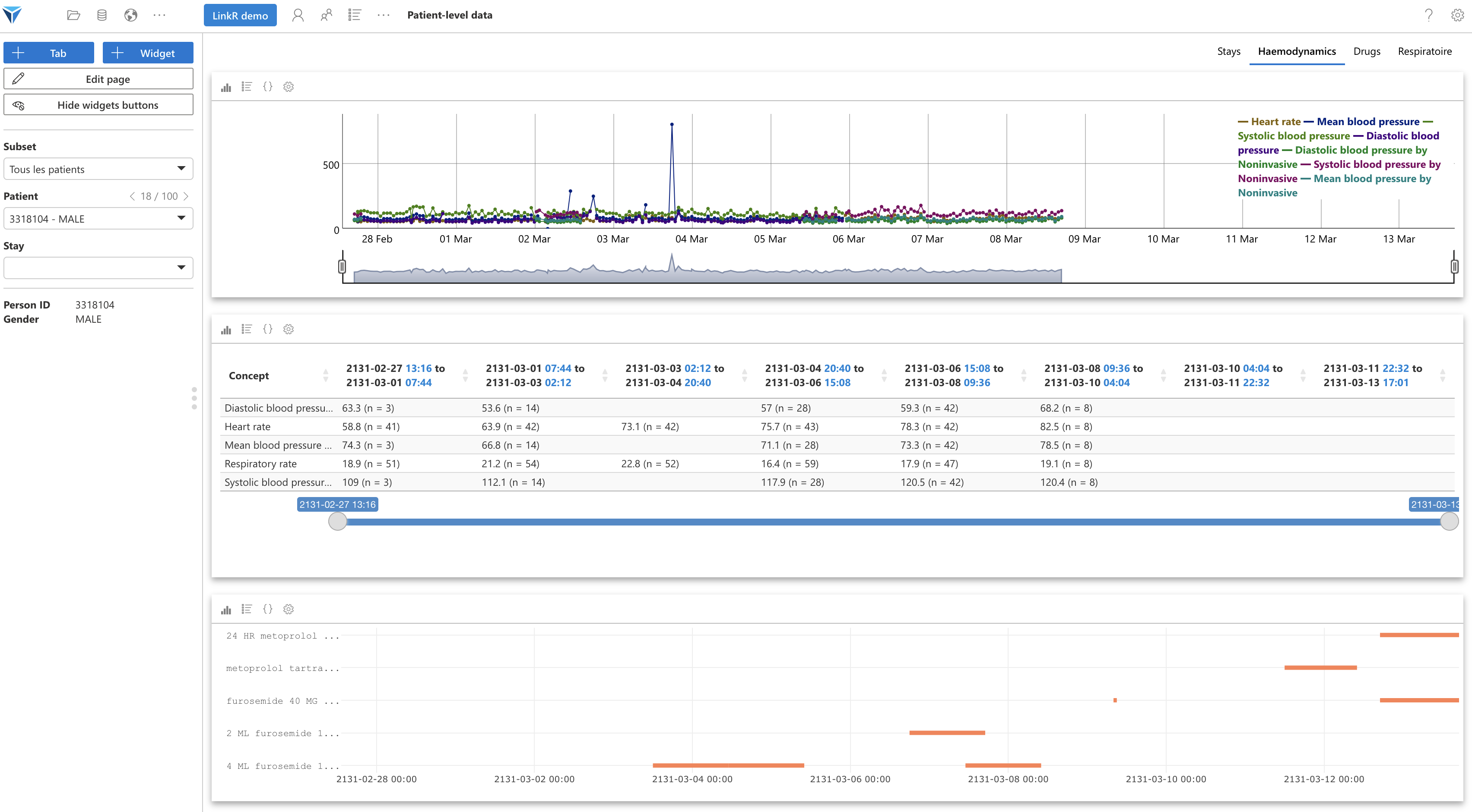
Here we have three widgets:
You can click on a part of the first figure to zoom in on a period. This will update the other widgets to display data for the period selected in the first widget.
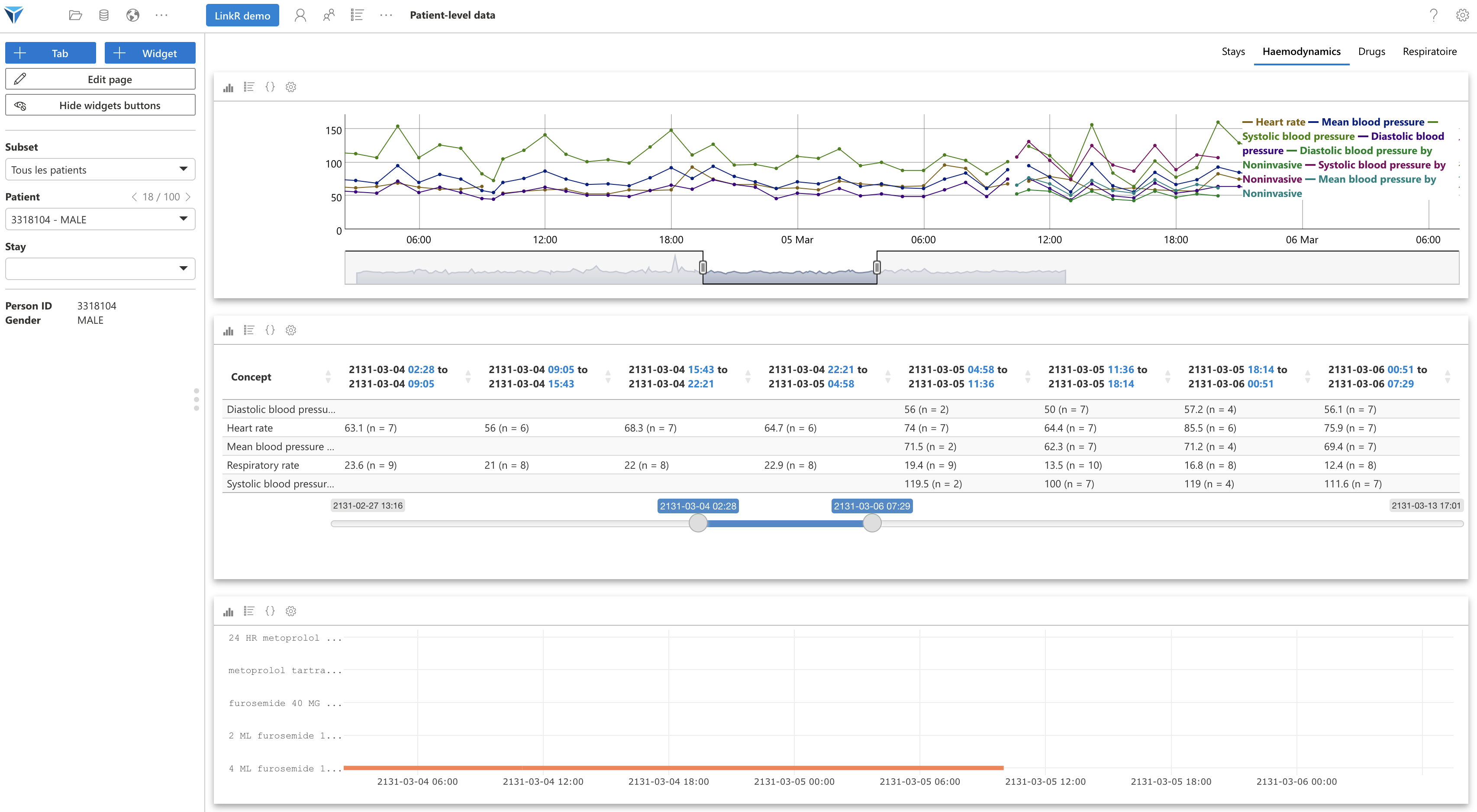
If you change patients, the data will also be updated.
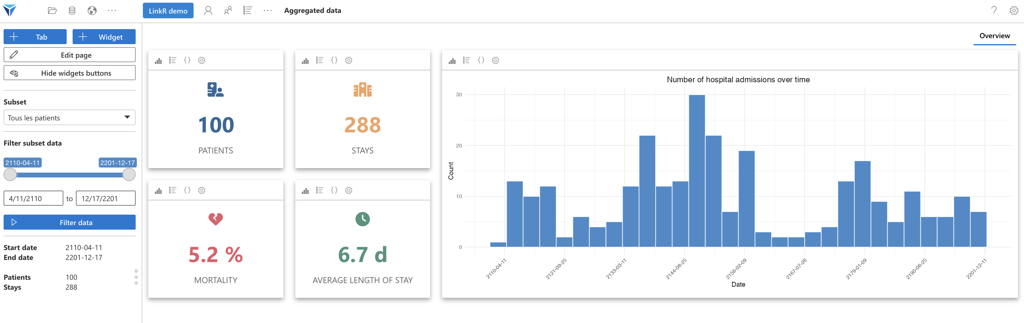
Note at the top of the page, next to the loaded project name, three icons:
Click on the second icon to go to the aggregated data page, where we will see a dashboard with information about the selected patients.
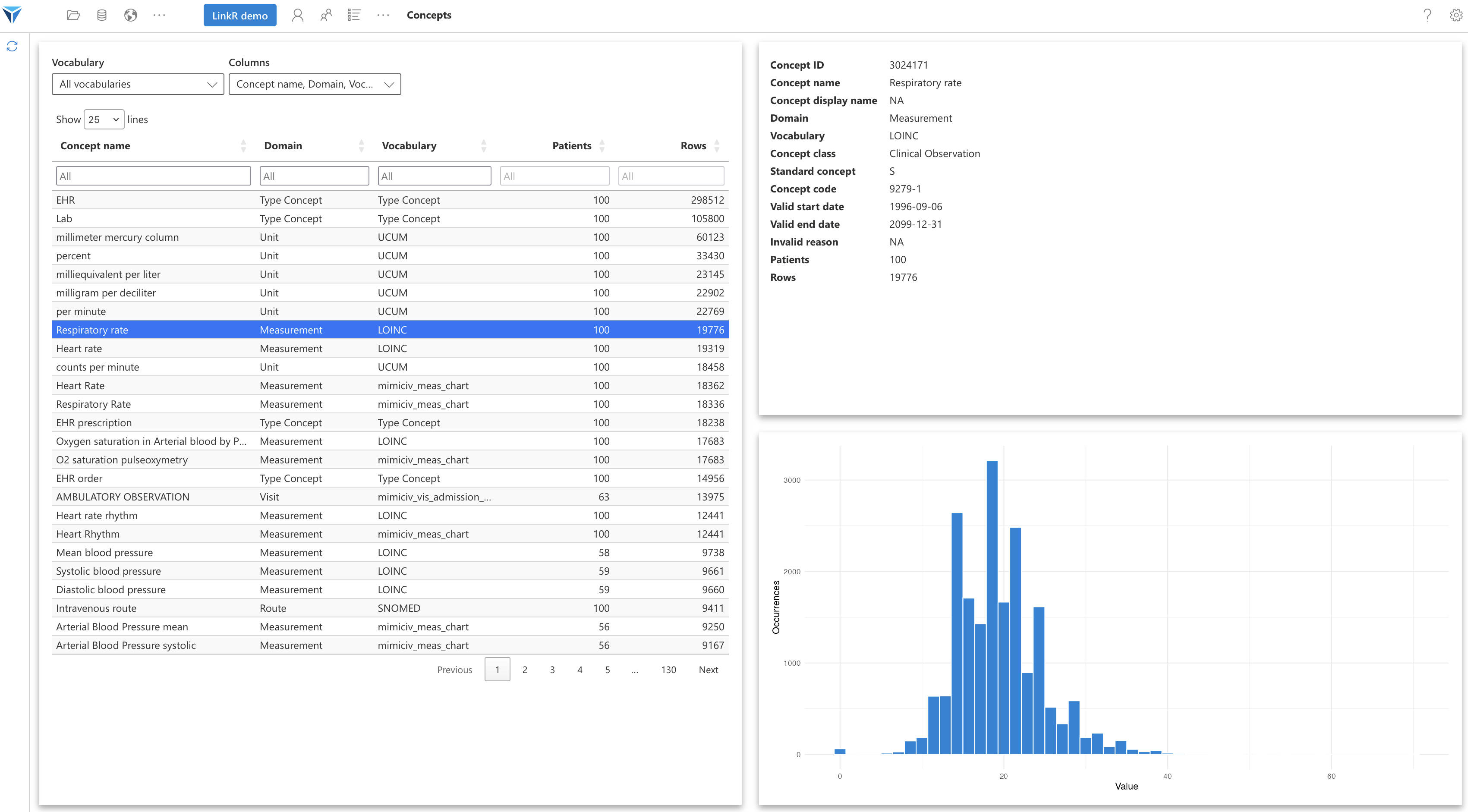
Last step of this overview, click on the third icon, the concepts one.
In the “Terminology” dropdown menu, select “All terminologies”.
You will then see all the concepts available in the dataset chosen for this project.
If you click on a concept, you will see its details, including its distribution.
Let's summarize:
We will now see how to create a tab and a widget ourselves!
Let’s go back to the patient-level data page (remember, with the person icon at the top of the screen).
We’re going to create a Respiratory tab, in which we’ll create a widget to display vital signs related to the patient’s ventilation.
Click on the “+ Tab” icon at the top left of the screen.
An “Add a tab” menu appears. Name it “Respiratory” and validate.
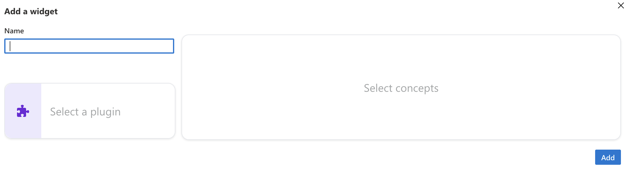
Once on this tab, click on the + Widget icon.
We will have three things to do:
When you click on “Select a plugin”, you will get the list of available plugins.
To display a plugin’s description, click on the “Information” icon.
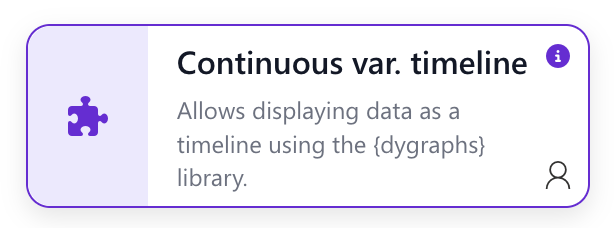
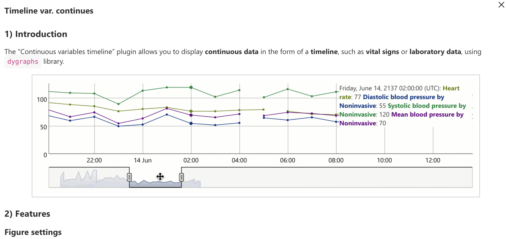
You will then get a description of the plugin’s features, which allows you to know if this is the plugin you need to display data as you wish.
If this plugin suits you, close the description and click on the plugin.
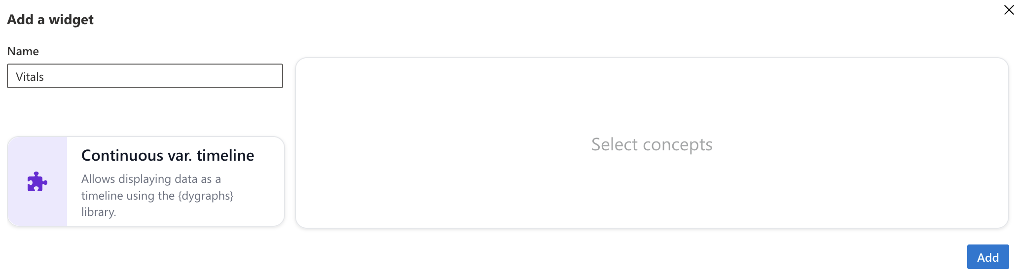
Finally, let’s choose the concepts to display by clicking on “Select concepts”.
For the example, we’re going to choose the LOINC terminology in the dropdown menu.
Choose the concepts:
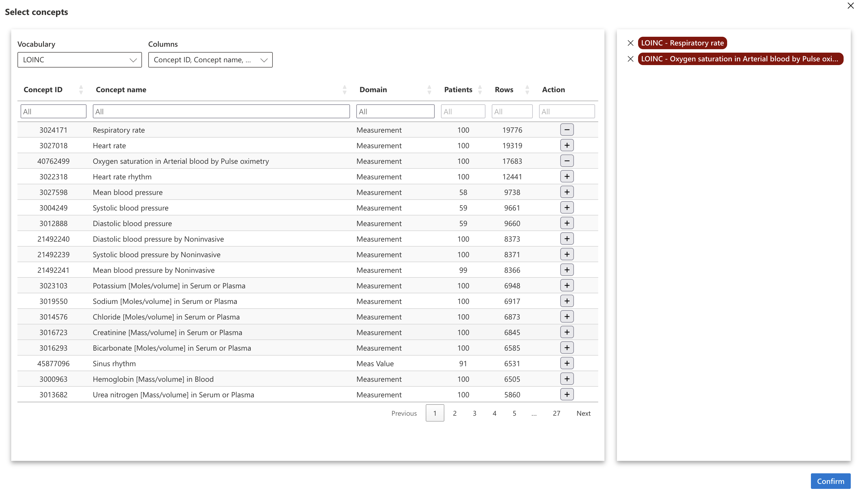
Click on “Validate” to confirm the concept selection, then on “Add” to create the widget.
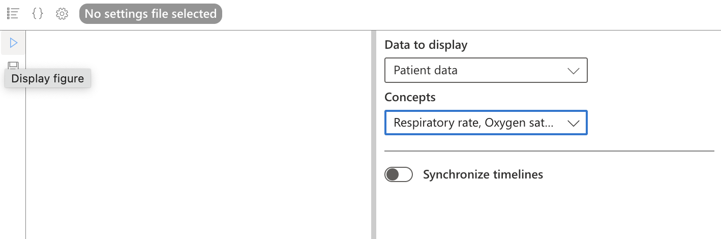
Choose the concepts to display in the dropdown menu, then click on “Show figure” to the left of the widget.
By clicking on “Edit page” on the left side of the screen, you can resize the widget.
We have therefore:
For more information on creating widgets, go to this page.
To understand LinkR's structure in more detail, go to the next page of the documentation.