Introduction
A project can correspond to a study (for example a study on mortality prediction), but also to data analyses outside of studies, such as creating dashboards (a dashboard to visualize the activity of a hospital department for example).
LinkR is a low-code data science application, which means you can:
- Visualize and analyze your data via a graphical interface, without using a programming language, by creating tabs and widgets (this is the no-code functionality)
- Analyze your data via programming scripts in R or Python, with all the libraries and functionalities available in each of these programming languages (this is the code functionality)
In this chapter, we will see:
- How to create and configure a project
- How to explore the concepts present in a dataset
- How to organize this data using tabs, widgets and scripts
- And finally how to share this project with the community
Creating a Project
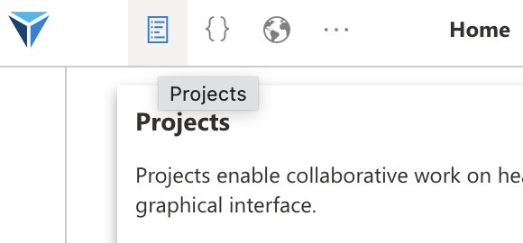
To start, go to the projects page, from the menu at the top of the screen or from the home page.
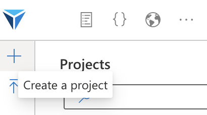
Then click on “Create a project”.
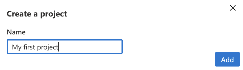
Choose a name for your project as well as the dataset to use, then click on “Add”.
You can always change the dataset to use for this project later, in the project configuration.
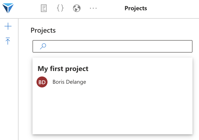
Click on the project to open it.
You arrive on the home page of your project.
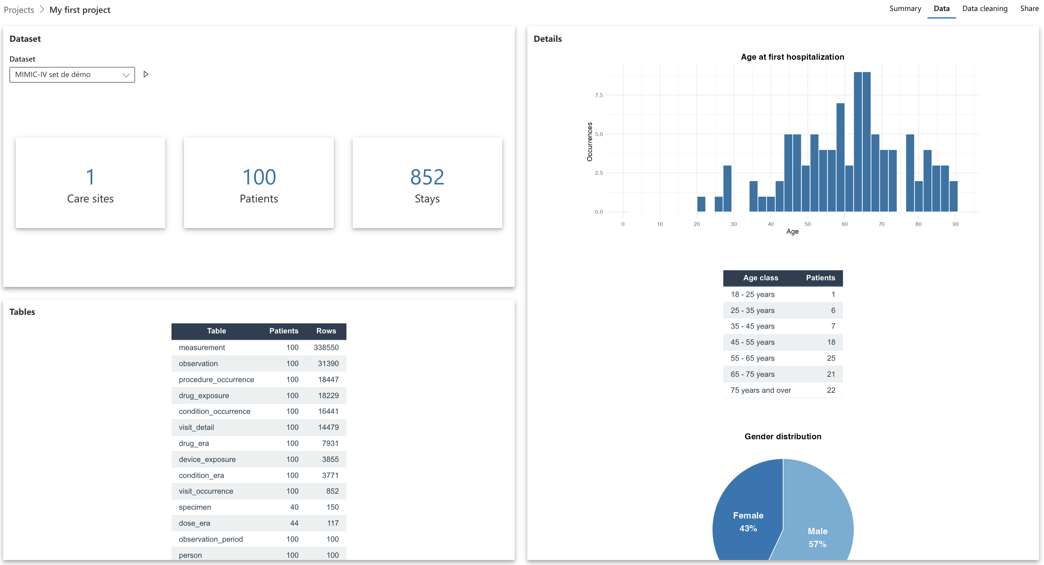
You see here that we have data from 100 patients, given that we chose the “MIMIC-IV demo” dataset when creating the project.
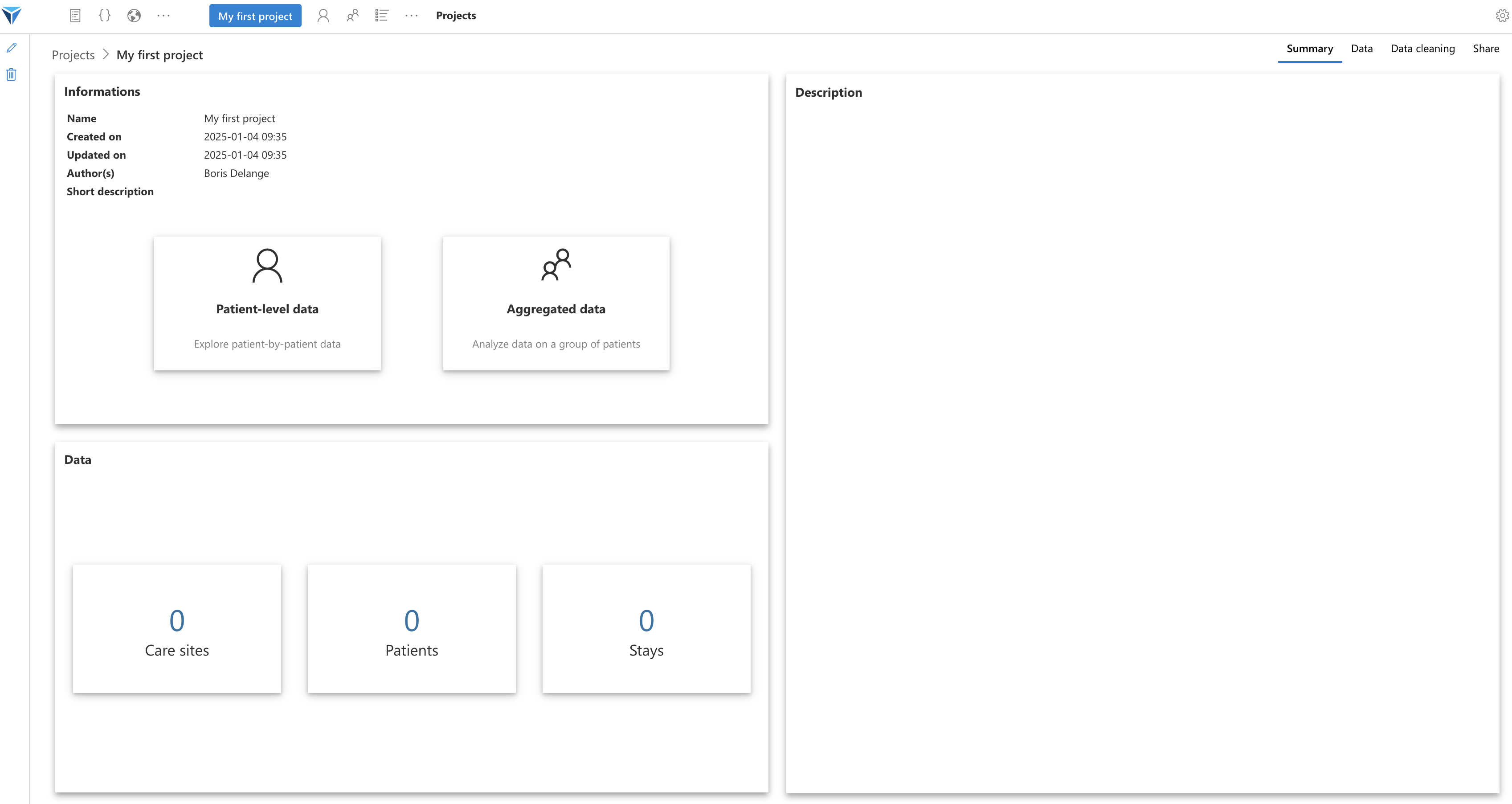
The project home page is divided into several tabs (at the top right of the screen):

Let’s look at these tabs one by one:
- Summary: this is the page we just saw, here are displayed the main information related to the project: the author(s), the project description, a quick view of the loaded data
- Data: here are available the details of the data loaded in this project: how many patients, how many stays, how many rows per OMOP table, with some figures to visualize demographic data
- Data cleaning: here will be configured the data cleaning scripts that will apply to the data when loading the project
- Share: this tab allows sharing your project with the rest of the community (by downloading it in Zip format or by updating a Git repository)
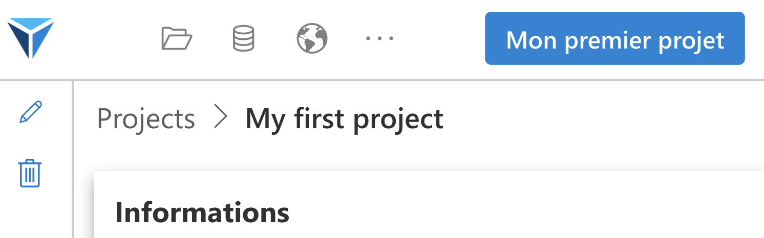
Note that the project name appears at the top of the screen. If I am on another page of the project (Individual data for example) and I click on the name, I will land again on the project home page.
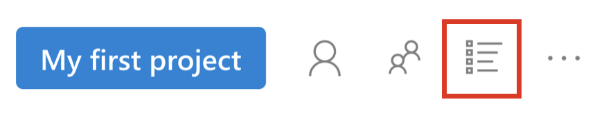
To the right of the project name, several buttons have appeared:

- Individual data (icon with a single person): to go to the page where you can configure the data to create a patient record
- Aggregated data (icon with several people): this is the page where you can visualize and analyze cohort data
- Concepts (icon with a list): you can search for concepts among those present in the imported dataset
- Subsets (available by clicking on the three dots): you can create subsets of patients by filtering them according to criteria
- Project files (also available by clicking on the three dots): you can manage scripts (R or Python) and data files created as part of the project
Configuring the Project
Now that our project is created, we will configure it.
We will go through the project tabs one by one (Summary, Data and Data cleaning).
Summary
Here it is mainly about modifying the information concerning your project, which will facilitate its sharing.
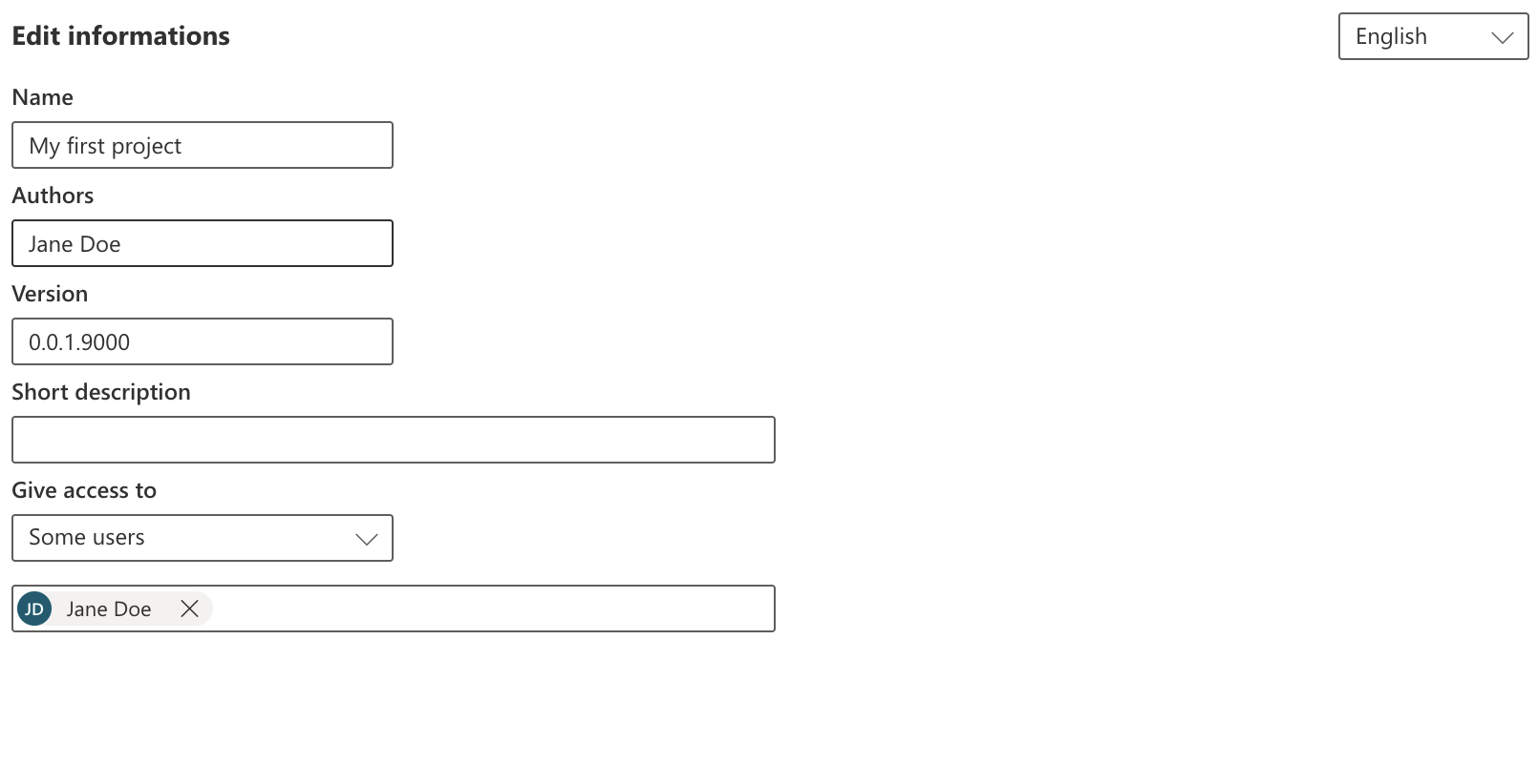
To do this, click on the “Edit information” button on the left of the screen (from the Summary tab).
You can then modify the following information:
- Name: this is the project name
- Authors: the different authors of the project, you can separate names with a semicolon (Jane Doe; John Doe)
- Version: this will allow the community to know the project version, in order to update it in case of modifications
- Short description: a description of the project in one sentence
- Give access: this will define who will have access to the project within your LinkR instance
The first four fields therefore concern the project description (this information will be useful particularly in case of project sharing), while the last element concerns access to the project only within your LinkR instance.
Note the dropdown menu at the top right, “English”: you can modify the name and short description of the project in different languages, which will facilitate its sharing.
We have so far given a brief description of the project, but users will need more information to understand your project.
For this, you can modify the long description of the project.
Click on the “Edit description” button on the right of the screen.
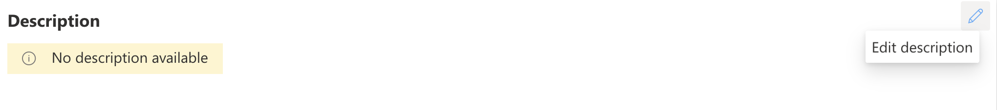
You will then see appear a text editor in markdown.
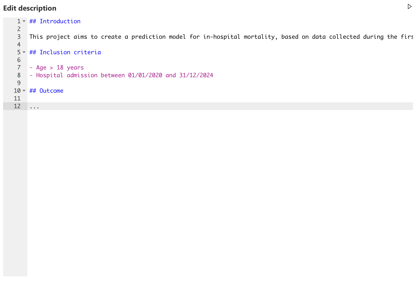
To view the rendering (in HTML), click on the execute button at the top right of the editor (Play icon), or use the shortcut CTRL/CMD + SHIFT + ENTER.
To save the modifications, click on the “Save modifications” icon (check icon), or use the shortcut CTRL/CMD + S.
Just like the short description, you can create one description per language.
Remember to save the modifications of your project information.
Data
Now go to the “Data” tab of our project.
If a dataset is selected, you will see different information concerning this dataset:
- Number of healthcare establishments from which the patients come
- Number of patients
- Number of hospital stays
- Amount of data per OMOP schema table (number of rows)
- Visualization of some data distributions (by clicking on “Patients” or “Stays”): age, sex, hospital departments…
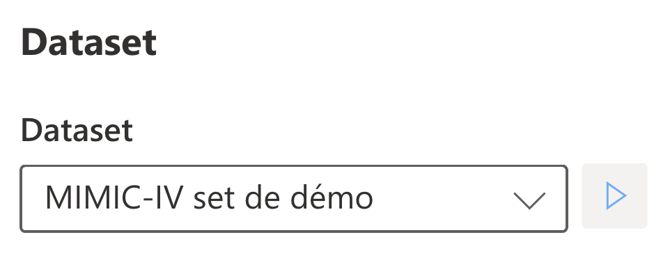
You can at any time change the dataset loaded in your project, by modifying the value of the dropdown menu.
For the new dataset to be loaded immediately, click on the “Play” icon next to the dropdown menu.
Data cleaning scripts
This part is still under development, be patient!
This will allow applying data preprocessing scripts, for example:
- Apply a script to exclude aberrant weight and height data
- Apply a script to calculate the SOFA score daily
Exploring Concepts
Go to the concepts page of the project via the icon to the right of the project name, at the top of the screen.
You will arrive on this page. Select a terminology in the dropdown menu to load its concepts.
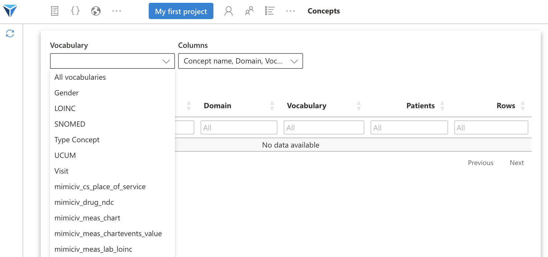
By selecting a terminology, you will see appear in the table the different concepts of this terminology used in the dataset loaded for your project.
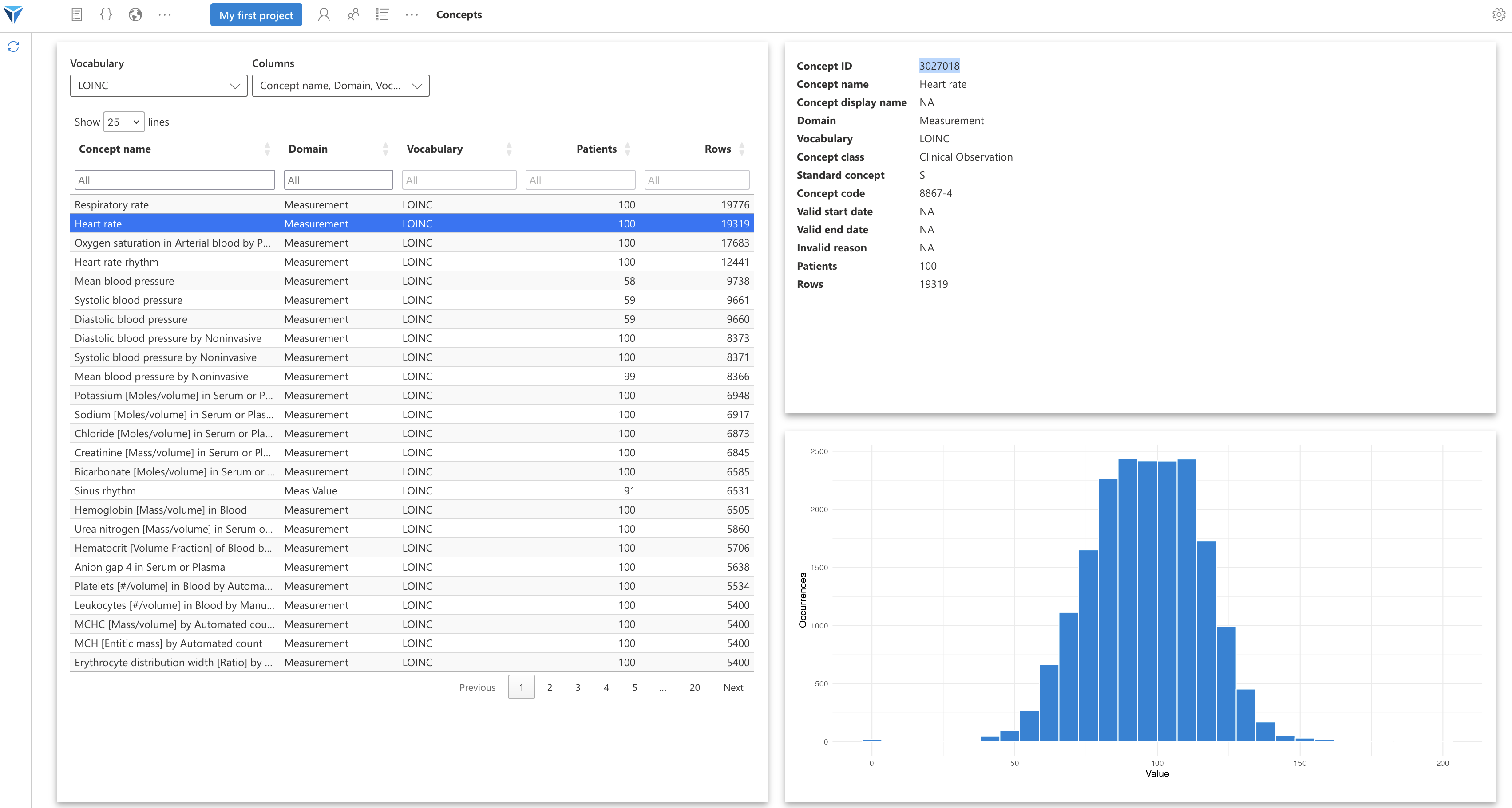
You will see the number of patients having at least once this concept in the “Patients” column, and the number of rows from all tables combined associated with this concept, in the “Rows” column.
When you click on a concept in the table, the information related to this concept will appear on the right of the screen.
You can notably retrieve the concept ID, which will be useful when you query the OMOP tables. You can also see the distribution of concept values in the loaded dataset.
You can filter concepts by their name, with the menu at the top of the “Concept name” column. You can also choose which table columns to display. These are the columns of the OMOP CONCEPT table.
All these terminology names can be overwhelming!
To untangle all this, we will quickly see what the OMOP model is and what the ETL process is.
OMOP Model
The OMOP model is a standard data model for health data.
It's a way to organize health data, in the form of a database with tables, each storing a particular type of data.
For example:
- The PERSON table stores data about individuals (mainly patients)
- The VISIT table stores data about hospital stays
- The CONDITION table stores information about patient diagnoses
Each piece of information in the OMOP database is coded using a concept, belonging to a terminology.
Each concept has a unique identifier that you can find via the ATHENA query tool.
Concepts are stored in the _concept_id columns of the different OMOP tables.
ETL Process
To obtain data in OMOP format from medical software, it is necessary to perform an ETL (Extract, Transform and Load) process.
During this process, data is transformed to be adequate to the OMOP data model (each software stores its data differently).
The different local concepts are aligned to the standard OMOP concepts. For example, a hospital's heart rate code will be aligned to the standard concept "Heart rate" from the standard LOINC terminology.
This concept alignment process is long and complicated, given that there are thousands of codes to align, often manually.
This is why the majority of OMOP datasets have only a portion of concepts that are aligned.
This is why you see in the dropdown menu above some standard terminologies (LOINC, SNOMED), and others local - non-standard (prefixed by mimiciv).
For more information on terminologies, go to the dedicated page of the documentation.
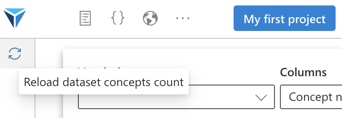
To reload the concept count, you can click on the “Reload count” icon at the top left of the screen.
Now that we have loaded a dataset and explored the concepts composing it, we will be able to visualize and analyze this data, using widgets.
For this, go to the Individual data page, either from the project summary tab, or from the icon at the top of the screen, to the right of the project title (the one with a single individual).

You will arrive on the Individual data page, where you will recreate a patient record according to the needs of your project.
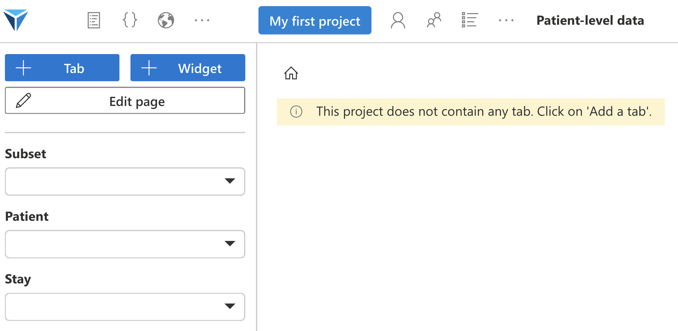
The menu on the left of the screen allows you to:
- add tabs: tabs allow organizing the different widgets
- add widgets: we will see, widgets are the elementary building block composing projects. They allow visualizing and analyzing data using plugins
- edit the page: once widgets are created, you can change their layout on the page. You can also modify or delete tabs.
- select patients: each subset contains several patients, each patient has one or more stays (hospital stay or consultation)
It’s up to you to choose how to organize your project.
For the individual data page, it is usual to create one tab per theme, with for example a “Hemodynamics” tab gathering data related to a patient’s hemodynamic state, or an “Infectious diseases” tab to display elements related to infectious issues: antibiotic treatments, microbiological samples, etc.
Let’s create a first “Hemodynamics” tab. To do this, click on the “+ Tab” button on the left of the screen, then choose a name.
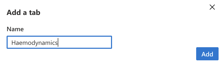
You will have a new empty tab. Tabs are displayed on the right of the screen.
We will now be able to add different widgets to this tab. Click on the “+ Widget” button on the left of the screen.
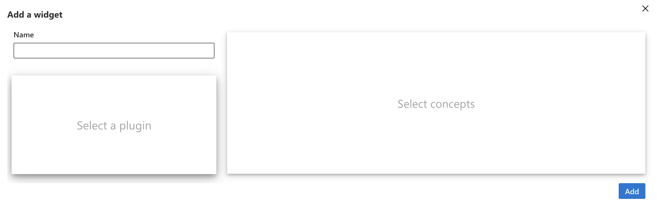
You will need to:
- choose a name
- choose a plugin
- choose concepts
A plugin is a script written in R and/or Python allowing to add functionalities to the application.
There are plugins specific to individual data, others to aggregated data, and others mixed.
Each plugin has a main functionality.
Some plugins serve to visualize a type of data, for example the plugin to visualize prescription data as a timeline, or the plugin to display structured data as a table.
Others serve to analyze data, for example the plugin to create a logistic regression model, or the one to train machine learning models.
Each step of a data science project can be transformed into a plugin, to save time and improve quality in data analysis. LinkR aims to offer more and more plugins, thanks to the work of its community.
For the example, we want to display patients’ hemodynamic parameters as a timeline.
We will therefore click on “Select a plugin”.
To display the description of a plugin, click on the “Information” icon.
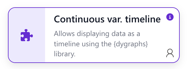
You will then have a description of the plugin’s functionalities, which allows you to know if it’s the plugin you need to display data as you wish.
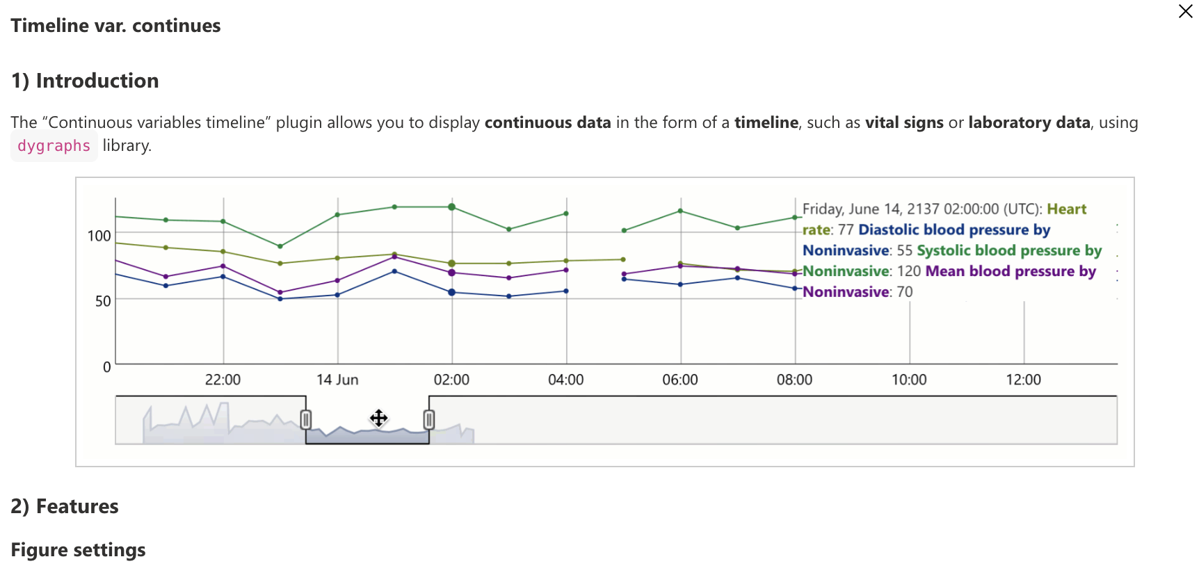
Click on the “Timeline continuous var.” plugin to select it.
Now let’s select which concepts to display, by clicking on “Select concepts”.
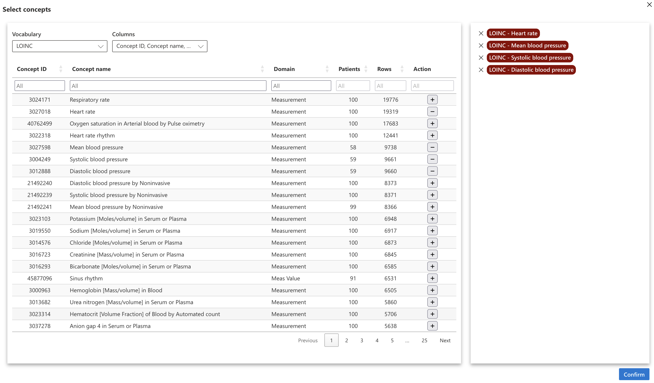
For the example, we selected the concepts of heart rate and systolic, diastolic and mean arterial pressures with the LOINC terminology.
Let’s choose a name, for example “Hemodynamic timeline” and click on “Add”. Our widget will appear on the page.
A widget will often appear in the same form, with three or four icons at the top of the widget, two buttons on the left and the save file name.
Let’s start with the menu at the top of the widget.

The icons are, from left to right:
- Figure: allows displaying the figure or more globally the result that the plugin is supposed to display
- Figure parameters: allows configuring the figure using a graphical interface
- Figure code: allows editing the R or Python code that displays the figure
- General parameters: these are the general parameters of the widget, allowing for example to show or hide certain elements
Each widget works the same way: a graphical interface allows configuring the figure. When parameters are modified, the corresponding R or Python code can be generated. Once this code is generated, it can be modified directly with the code editor, which allows going beyond what the graphical interface alone offers.
Widgets work with save files, allowing saving both figure parameters and figure code. This allows creating several configurations for the same widget.
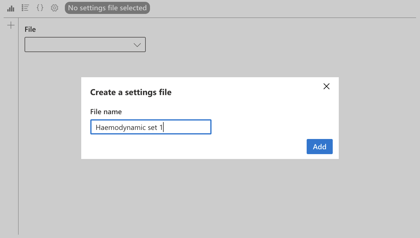
To choose a save file, click on the file name (here “No save file selected”), then select the file in the dropdown menu.
To create a save file, click on the “+” icon on this same page, choose a name and create the file. For this first example, we choose the name “Hemodynamic set 1”.
Once the file is created, the parameters saved in the “Figure parameters” and “Figure code” pages will be saved in this file.
Before configuring our figure, let’s look at the “General parameters” of the widget.
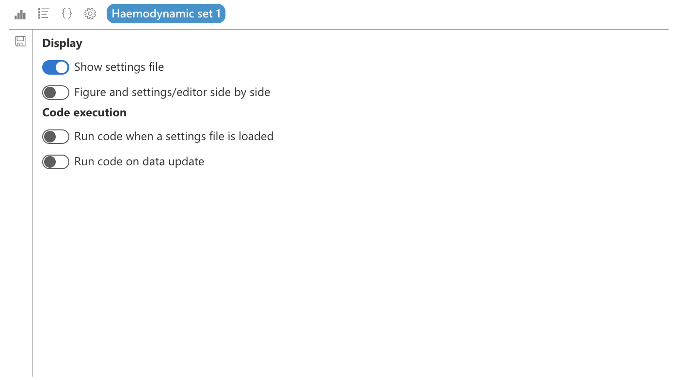
In the “Display” section, we can choose to show or hide the selected save file.
We can also choose to display parameters and the editor side by side with the figure. This will divide the widget screen into two parts, with the figure on the left and the parameters or figure code on the right, which is useful to quickly see the result of our parameters.
In the “Code execution” part, we can choose to execute the code when loading a save file: when loading a project for example, the last selected save file will be loaded, which allows initializing all widgets when loading the project. I can also choose not to load a widget, if it is likely to take time to execute and if it is not necessarily needed as soon as the project loads.
The “Execute code when updating data” option allows for example to update the figure when the patient changes, if this widget uses data patient by patient.
We will therefore choose to hide the save file, display parameters or editor side by side with the figure, and execute code both when loading the save file and when updating data.
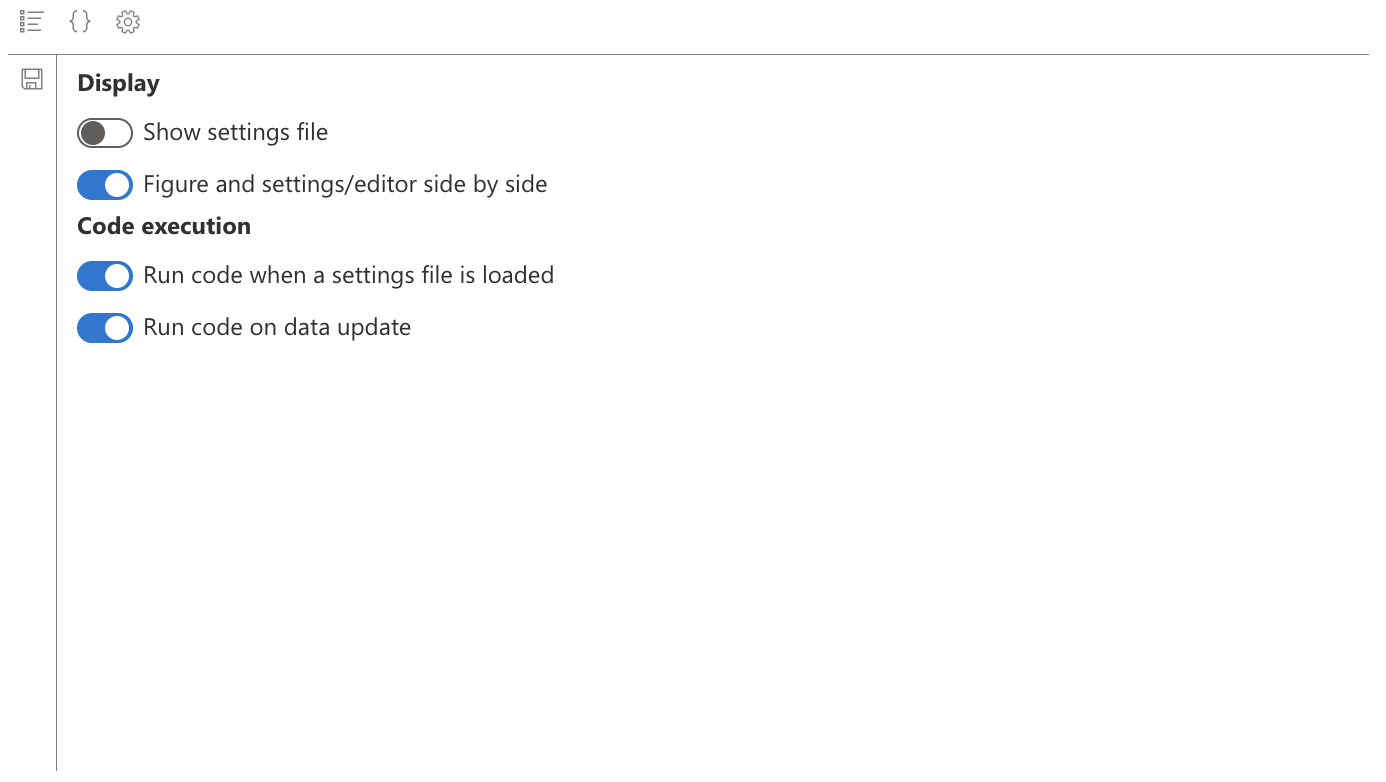
We see the save file name disappear, and also the figure icon: indeed, the figure will be displayed in the “Figure parameters” and “Figure code” tabs.
Don’t forget to save your general parameters with the icon on the left of the widget. The widget’s general parameters depend on the widget, and not on a save file.
Before displaying our data, let’s adjust one last detail: let’s enlarge the widget.
To do this, click on “Edit page” on the left of the screen. You will then see new icons appear at the top right of the widget:
- an icon to put the widget in full screen, which is useful in the widget configuration phase
- an icon to modify the widget, if you want to modify the name, or add or remove concepts
- an icon to delete the widget
There are also icons at the four corners, which allow defining the widget size.
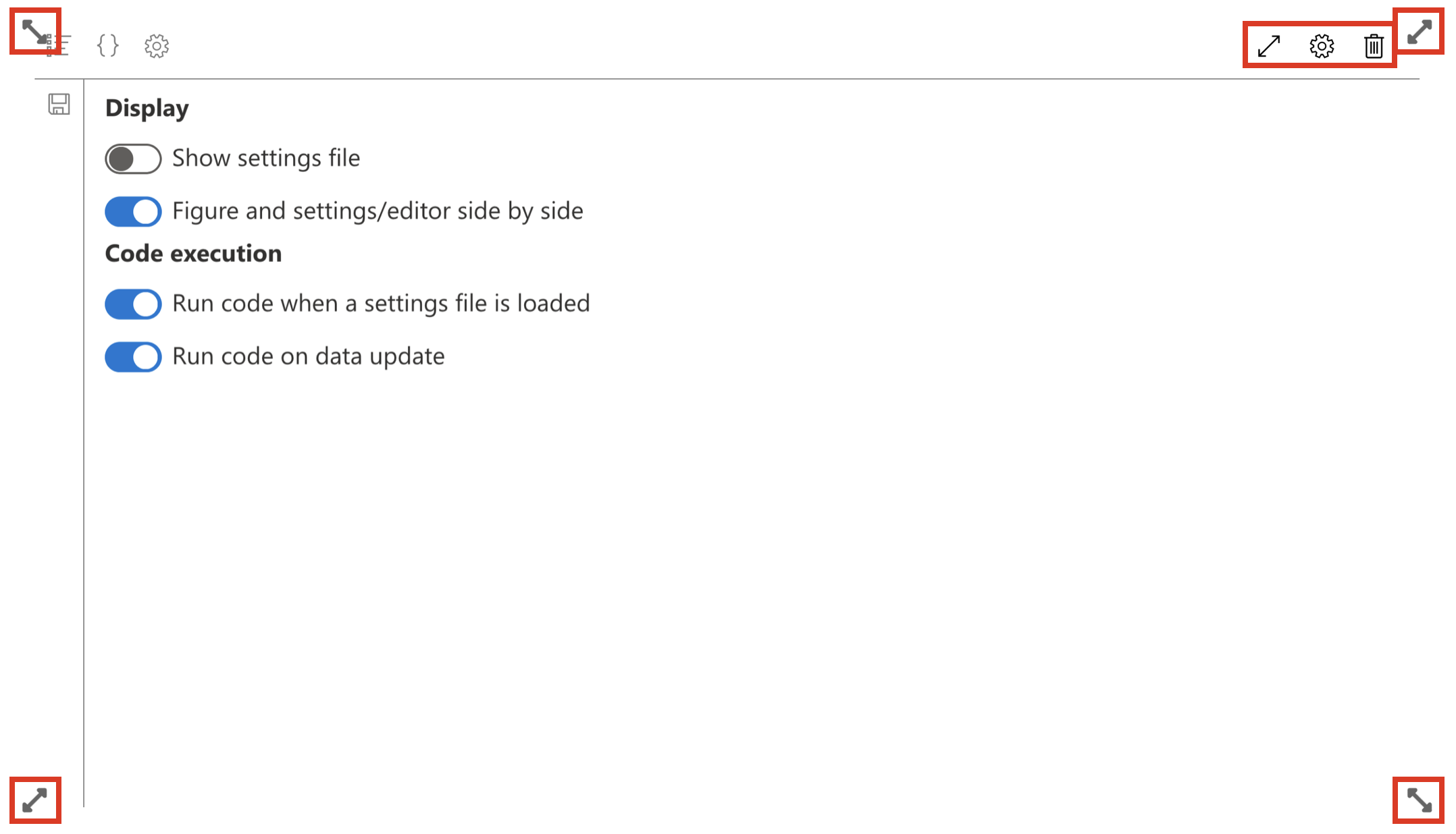
Let’s make the widget take the full width of the screen and a third of its height.
Then put it in full screen mode. Click on “Validate modifications” on the left of the screen to exit “Edit” mode.
Let’s go to the “Figure parameters” section to configure our figure.
For this plugin, we have three options:
- Data to display: do we want to display the selected patient’s data, or only the selected stay?
- Concepts: which concepts to display? We see here appear the concepts we selected when creating the widget. We can choose to display only some of them.
- Synchronize timelines: this can be useful to synchronize different widgets with each other.
Select “Patient data” in “Data to display”, then “Heart rate” in the concepts dropdown menu.
Then click on the “Save” icon on the left of the widget, then on the “Display figure” icon (Play icon).
You will be asked to select a patient: indeed, we had not yet chosen a patient.
Start by selecting “All patients” in the “Subset” dropdown menu, then any patient.
Since we had selected to update the code when changing patient, you should see the selected patient’s heart rate as a timeline.
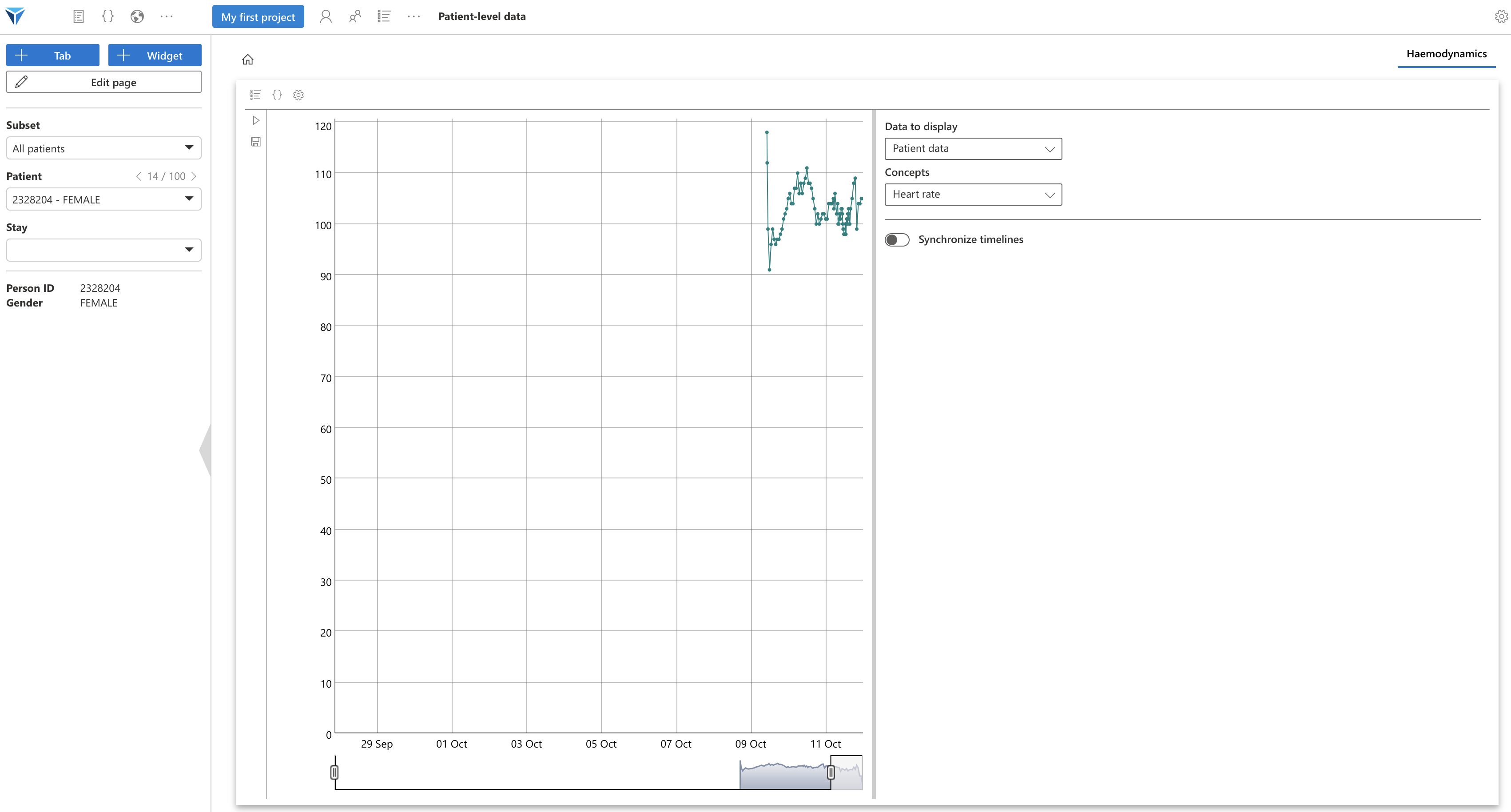
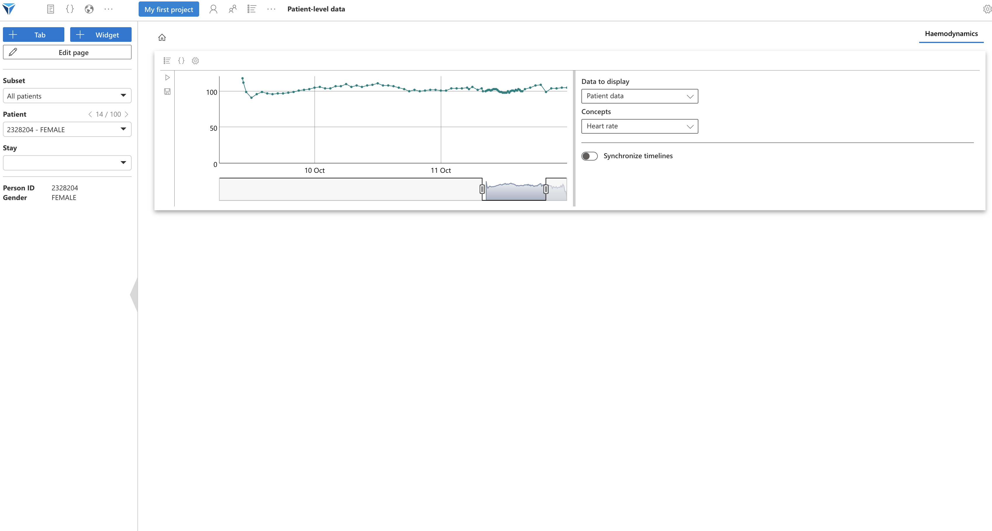
Click again on “Edit page”, then exit full screen mode. Your widget should resume the dimensions you had assigned: a third of the page height and full width, which is suitable for this timeline.
You can zoom on the figure, and change the selected time interval.
Your turn to play!
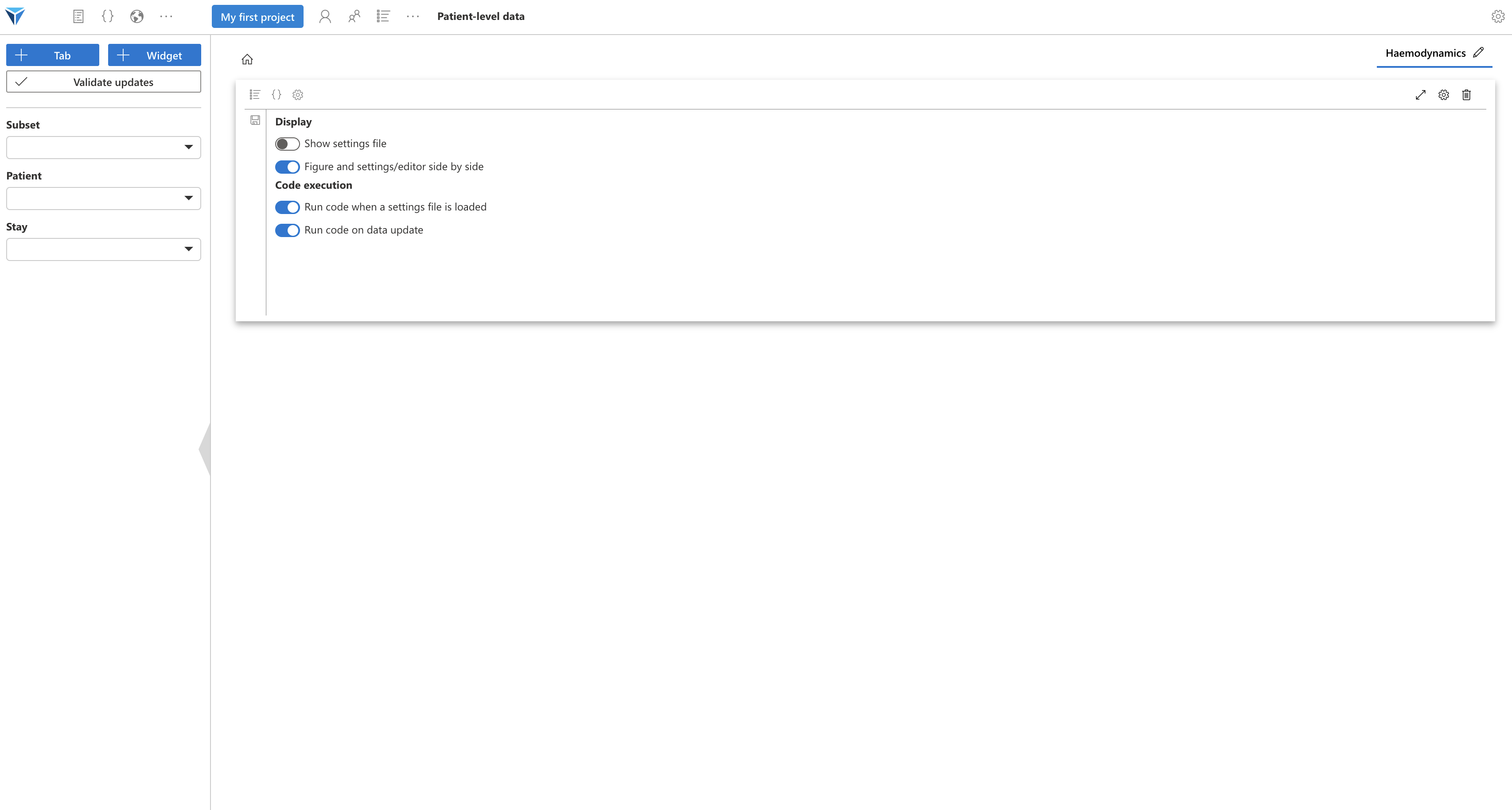
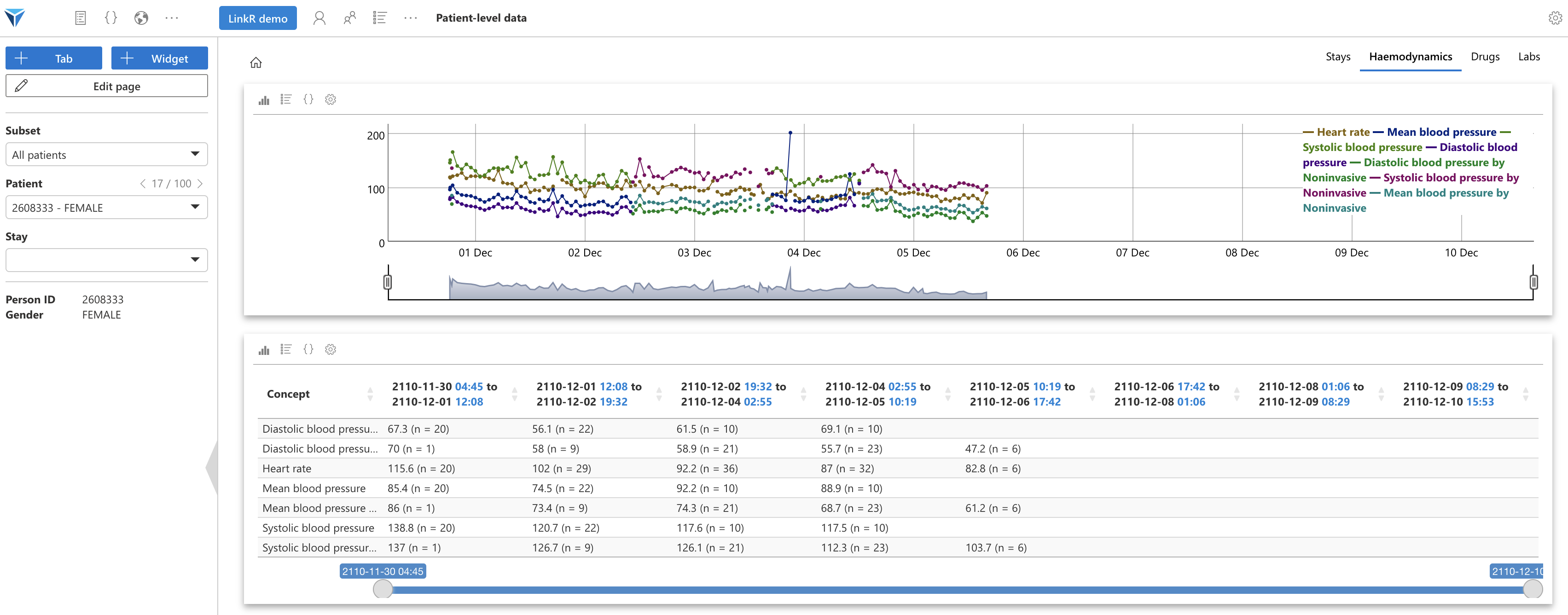
Now try to:
- Create a new save file for the current widget, "Hemodynamic set 2" for example
- Configure the widget to display heart rate and systolic, diastolic and mean arterial pressures
- Create a new widget with the "Data table" plugin, where you will display the same concepts
- Synchronize the timelines of the two widgets
You should get something like this:
We have seen how to create tabs and widgets to create a patient record, on the “Individual data” page.
The principle is the same for the “Aggregated data” page, except that tabs generally correspond to steps of a research project, with for example a widget to create the study outcome, a widget to exclude aberrant data or a widget to train machine learning models.
Scripts and Files
Coming soon…
Sharing the Project
Once your project is configured, you can share it by integrating it into your Git repositories, directly from the application.
Go to the “Share” tab from the main project page (by clicking on the project name, in blue, at the top of the page).
The tutorial for sharing content is available here.
Conclusion
We have seen how to create and configure a project, in order to visualize and analyze data thanks to LinkR's low-code interface.
We will see in the rest of the documentation: